The biotech website has a different job than most B2B sites. It has to make a scientific case credible to investors, a clinical case credible to physicians, and a company case credible to recruits — usually on the same homepage, often with no commercial product to anchor the design. The 44 sites below get that balance right. Some are corporate giants; some are clinical-stage therapeutics; some are tools, diagnostics, and consumer biotech brands. Every one of them earns its place with a specific design decision worth stealing.
We curated this list as a biotech website design agency — meaning we ranked these the way we’d defend a recommendation to a CEO who’s paying for the next site. Visual polish matters. So does navigation, mechanism-of-action clarity, pipeline legibility, and the small details that signal a company has its act together. The companies at the top of the list got more right than the companies at the bottom.
How We Ranked These 44 Biotech Websites
This list is opinionated. With nearly 15 years building sites for biotech, pharma, diagnostics, and lab equipment companies, we filtered for the choices that actually move how investors, HCPs, and patients read a site — not the surface flair that wins design awards.
Visual storytelling that respects the science
A biotech site has to communicate complex modalities — gene therapy, RNAi, CRISPR, T-cell engineering, mRNA — to audiences with wildly different scientific literacy. The strongest sites use custom illustration, mechanism diagrams, and motion that simplifies without dumbing down. The weakest ones lean on stock photos of researchers staring into pipettes.
Navigation that matches buyer intent
A clinical investigator looking for a trial site, a portfolio manager checking the Q3 readout, and a patient looking for an expanded access program want three different things from the same homepage. The top sites route each of them to a clear next step inside one click; the lower-ranked sites force everyone through the same menu.
Pipeline and proof, surfaced not buried
For therapeutics companies, the pipeline page is the most-read page on the site after the homepage. Sites that nail this make the pipeline scannable — modality, target, indication, phase — without forcing the reader to download a corporate deck. For tools and diagnostics, the equivalent is product depth: spec sheets, validation data, and integration details that engineers can verify.
Brand consistency between the science and the design
Color palette, type system, photography, and graphic language should feel like the same company across pipeline, publications, careers, and investor pages. The best sites on this list hold the brand across hundreds of pages; the weakest ones look like three different agencies built three different sections.
Technical execution and AI readability
In 2026, sites compete not just for human attention but for citations in AI search — AI Overviews, Perplexity, ChatGPT Search, Claude. Sites with clean semantic HTML, server-rendered key claims, and structured data on pipeline and leadership get cited; sites that hide their science behind JavaScript do not. Several entries below earned points for executing this well.
A note on bias: Digital Elevator builds websites for biotech and life sciences companies. We didn’t include ourselves on the list — but the same four filters above are the ones we use when we audit a client’s existing site before a redesign.
The 44 Best Biotech Websites of 2026
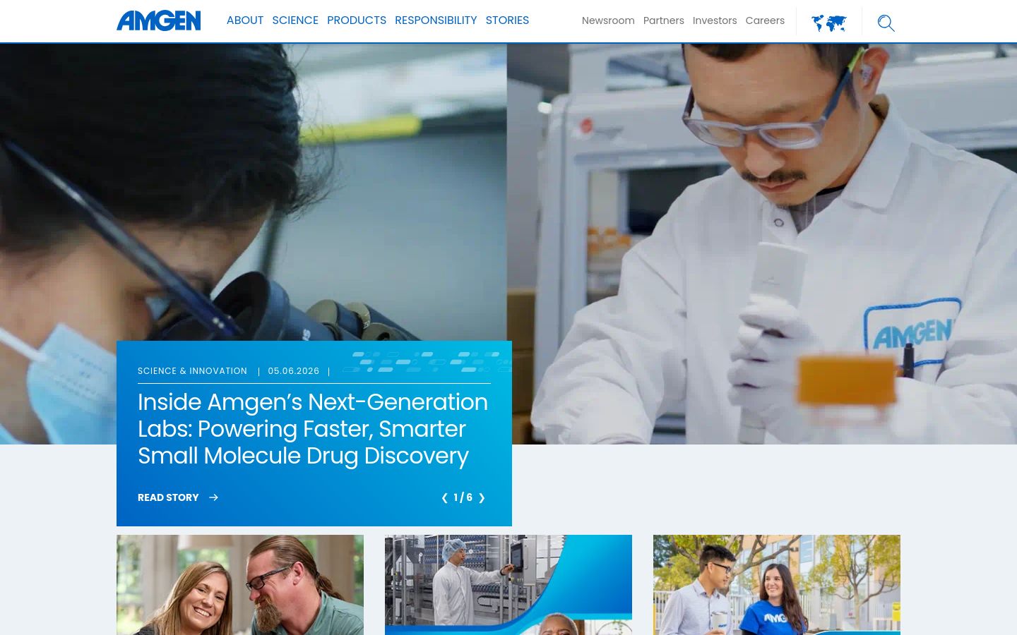
44. Amgen
Amgen’s site does what most large-cap pharma sites fail to do: it humanizes a sprawling oncology and bone-health portfolio without diluting the science. The hero rotation surfaces a different therapeutic area on each load, the color system stays calm enough to let dense pipeline content breathe, and the patient-story video work avoids the staged-smile cliché that haunts most pharma sites.
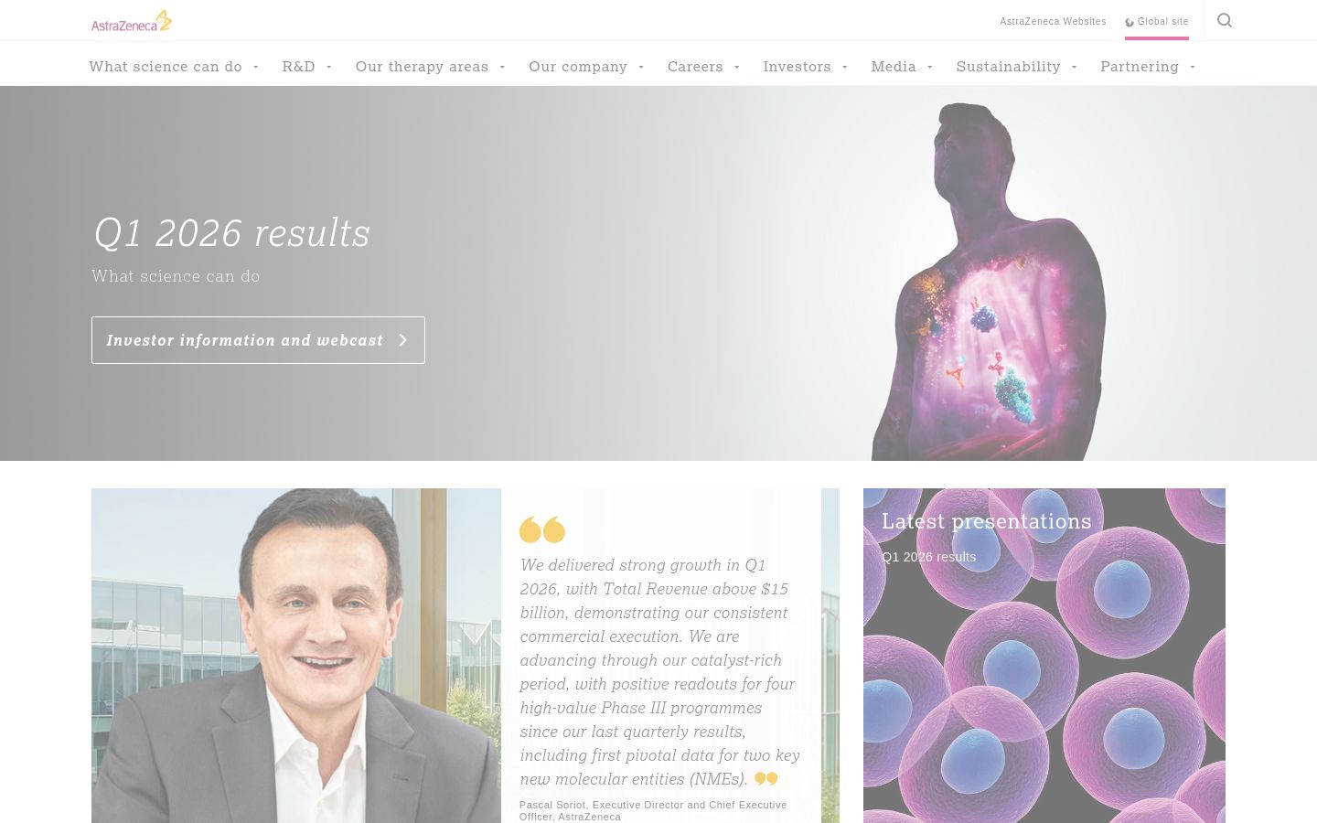
43. AstraZeneca
AstraZeneca leans on custom photography rather than stock — researchers in actual labs, patients in actual settings — and the result is a corporate site that reads as a science company instead of a holding entity. The therapeutic-area navigation routes investors, HCPs, and patients to three genuinely different experiences without making the homepage feel fragmented.
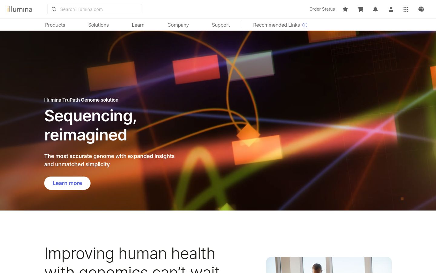
42. Illumina
Illumina runs the genomics tools category, and the site reflects it: dense product taxonomy organized around use case (single-cell, oncology, reproductive health) rather than SKU. The decision to treat the homepage as a routing layer for technical buyers — rather than a corporate marketing brochure — is the move other tools companies should copy.
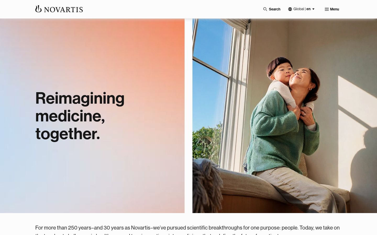
41. Novartis
Novartis took a corporate refresh in the last two years and the restraint shows. The type system is consistent across thousands of pages, the photography moves between people and abstract scientific imagery without feeling stitched together, and the IR section is unusually well-designed for a top-five pharma — which matters more than it sounds when analysts spend hours there each quarter.
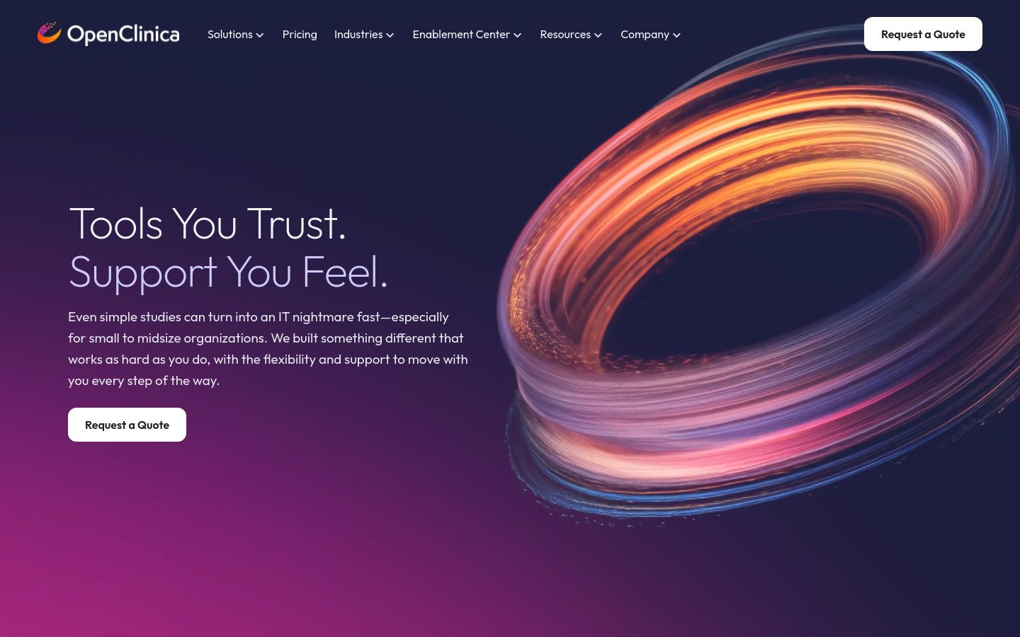
40. OpenClinica
OpenClinica is a clinical trial software company and the site is correct for the audience — sponsors, CROs, and sites looking to evaluate eClinical infrastructure. The product pages skip the soft B2B marketing fluff and go straight to integrations, deployment models, and regulatory documentation. That sounds basic; very few B2B health-tech sites manage it.
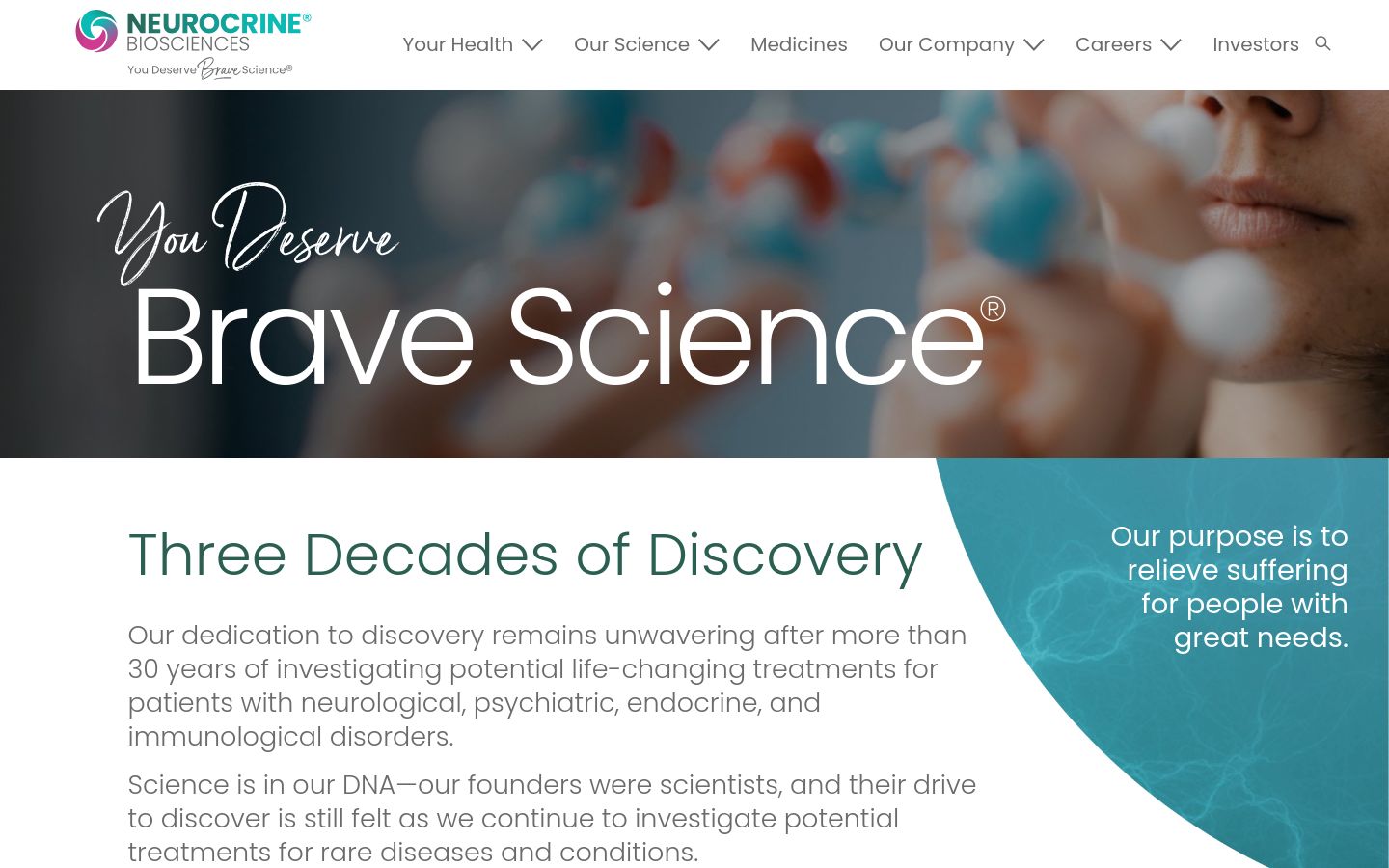
Neurocrine’s pipeline-and-platform page is one of the cleaner mechanism-of-action presentations in mid-cap neuroscience — modality, target, indication, and phase laid out in a table that a portfolio manager can read at a glance. The site’s restraint with motion (it animates only when the content benefits) is a useful counterexample to peers that over-animate.
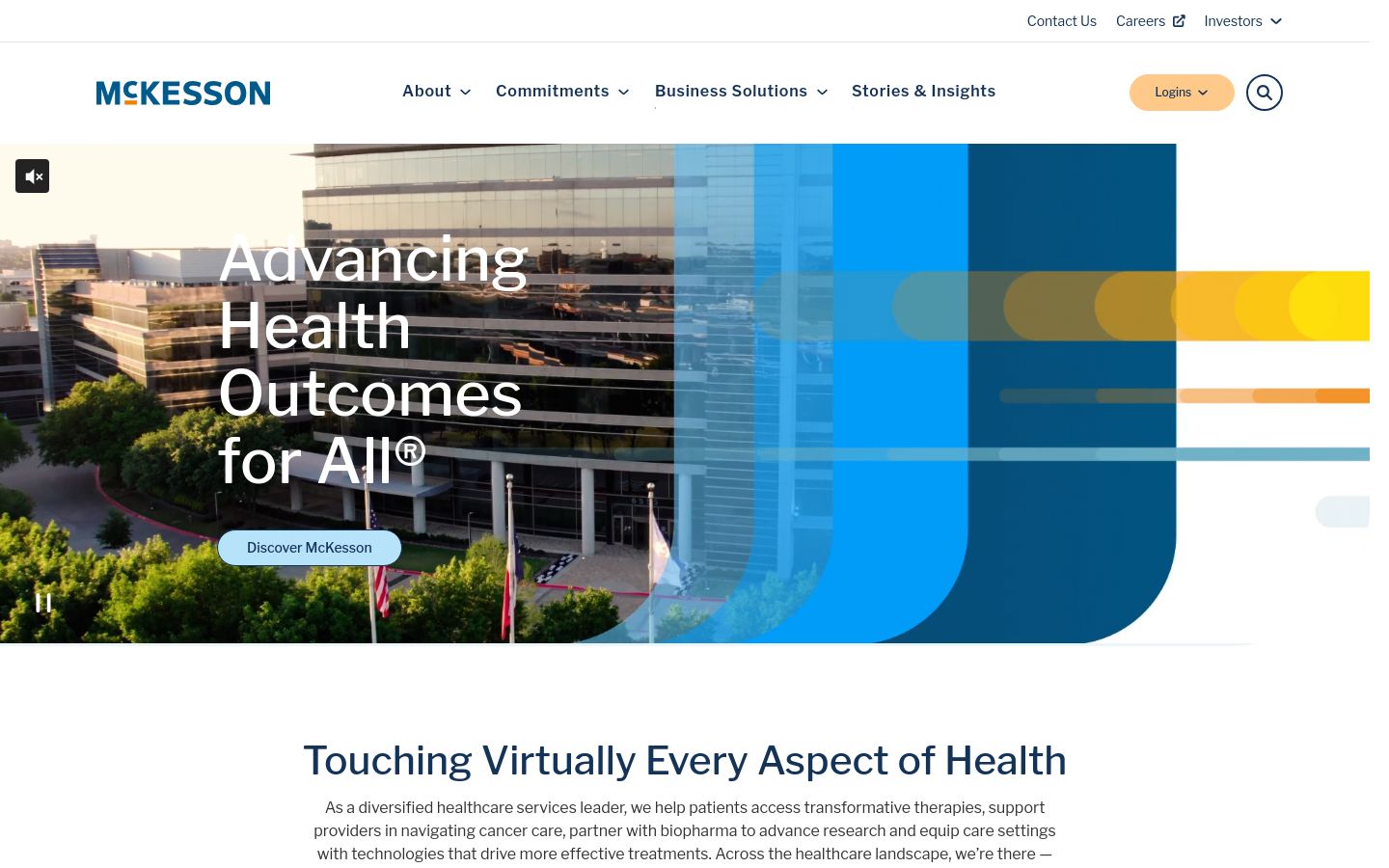
38. McKesson
McKesson is a healthcare distribution and services giant, and the site correctly treats the homepage as a stakeholder routing problem — providers, pharmacies, manufacturers, payers each get their own front door. The visual language is unflashy, which is the right call for a company whose buyers care about uptime and contract terms, not visual flourish.
37. Bluebird Bio
Bluebird’s positioning around gene therapy for severe genetic disorders is reinforced by the visual decision to keep the design human-centered rather than molecule-centered — patient and family photography sits at the top of the hierarchy, mechanism content is one click deeper. For a company whose value prop is “we change lives once and for all,” that ordering is correct.
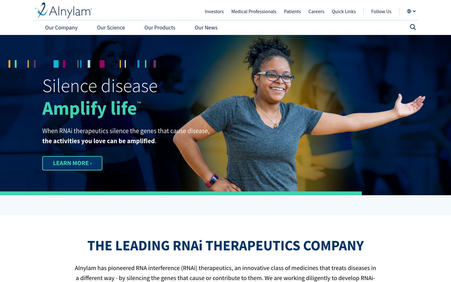
36. Alnylam
Alnylam’s site is the best public-facing explainer of RNA interference therapeutics on the open web. The custom mechanism graphics on the platform page walk a non-specialist through siRNA action without losing precision, and the same illustration system propagates across pipeline, publications, and investor materials.
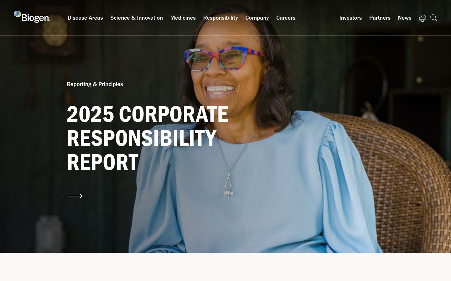
35. Biogen
Biogen’s site is unusually generous with patient stories — short documentary-style video paired with quiet typography rather than overdesigned testimonial cards. For a company anchored in neurological diseases (Alzheimer’s, MS, SMA, ALS), the editorial restraint is the design choice. Loud would have been wrong.
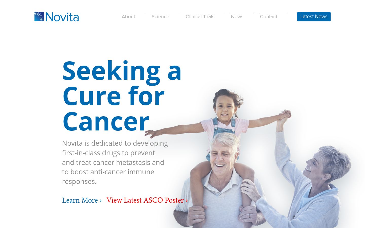
Novita’s oncology site uses 3D molecular animation and scroll-linked motion better than most clinical-stage biotechs at its scale. The blue-on-blue palette could collapse into monotony, but the subtle value steps give the site enough hierarchy to stay readable across long pipeline and publication lists.
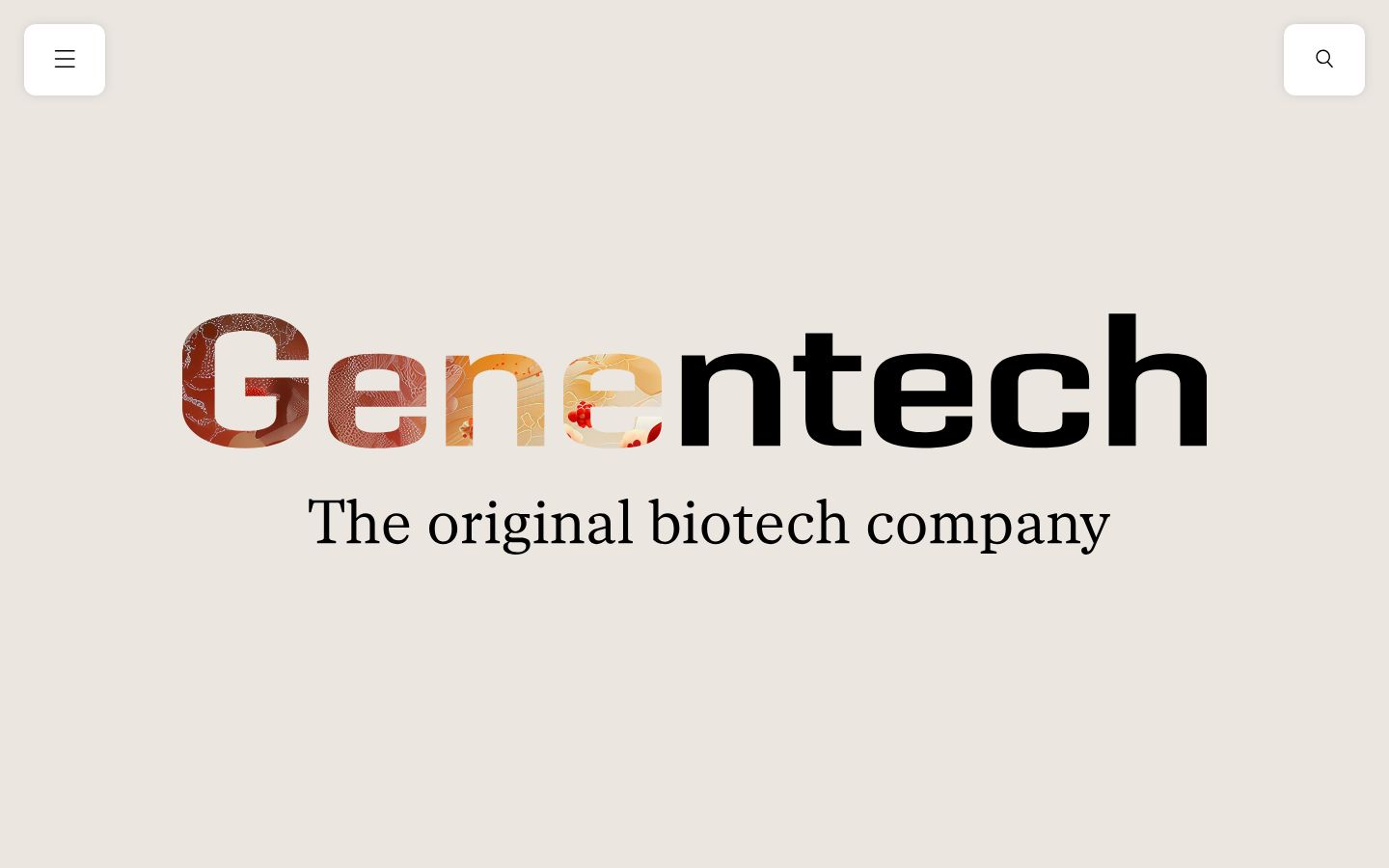
33. Genentech
Genentech’s illustration style — a cartoonish, deliberately diverse human-centered system — is one of the few genuine breaks from the photographic stock-look that defines most pharma. The system holds across employee stories, patient pages, and science explainers, which is the harder test.
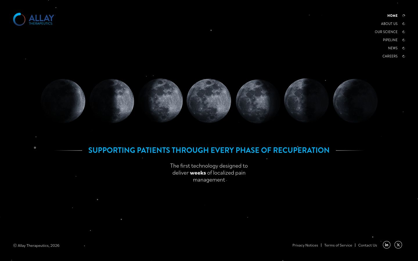
Allay’s recovery-focused product (long-acting non-opioid pain relief post-surgery) is reflected in a recurring moon motif that quietly signals the post-op night the company helps patients sleep through. The metaphor would feel forced anywhere else; here, it earns its place across the whole site.
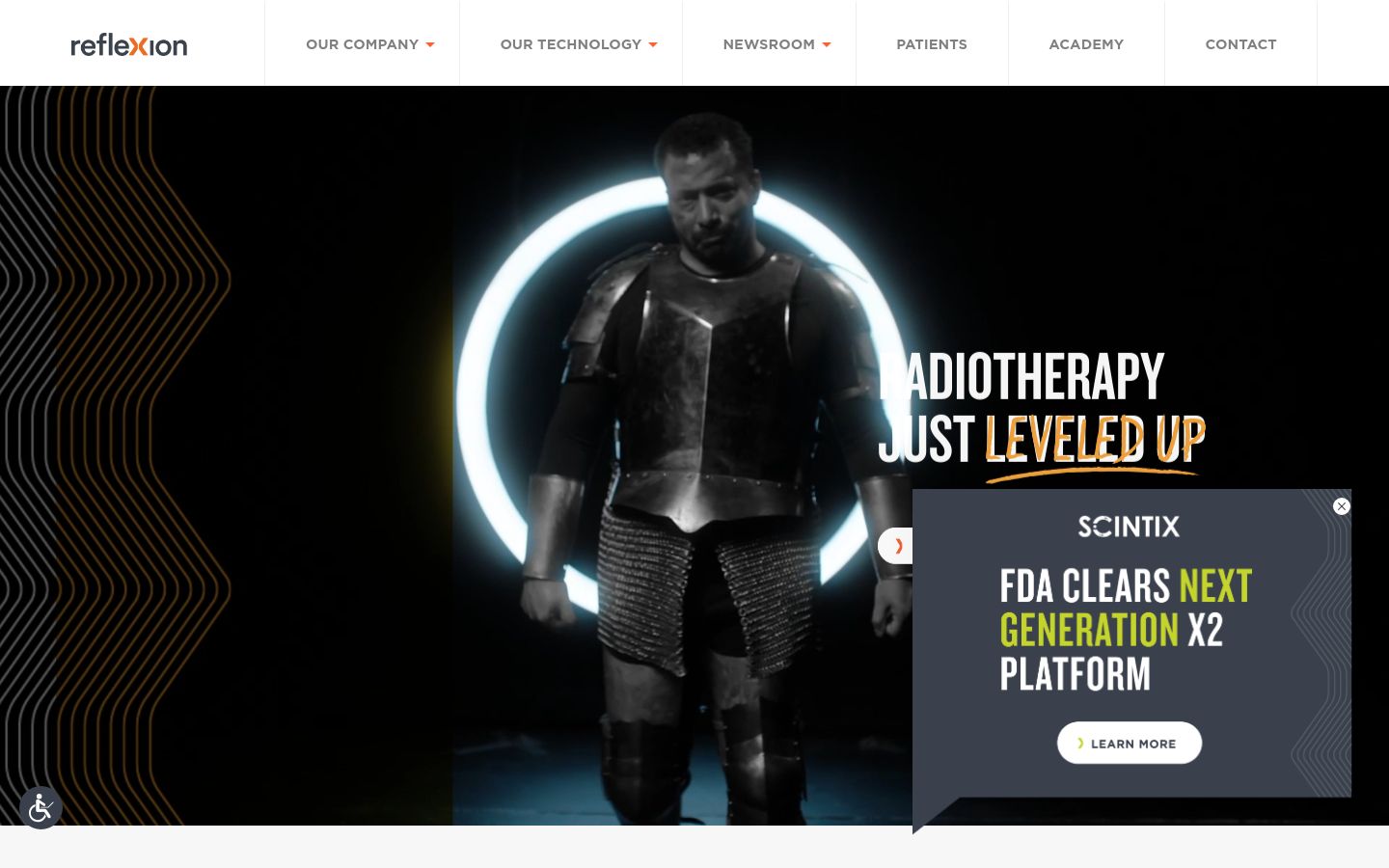
31. Reflexion
Reflexion’s homepage uses a converging-elements load animation that mirrors the company’s biology-guided radiotherapy mechanism — beams converging on a target. The metaphor is technical and on-message, and it gives the site a memorable visual hook without sliding into gratuitous motion.
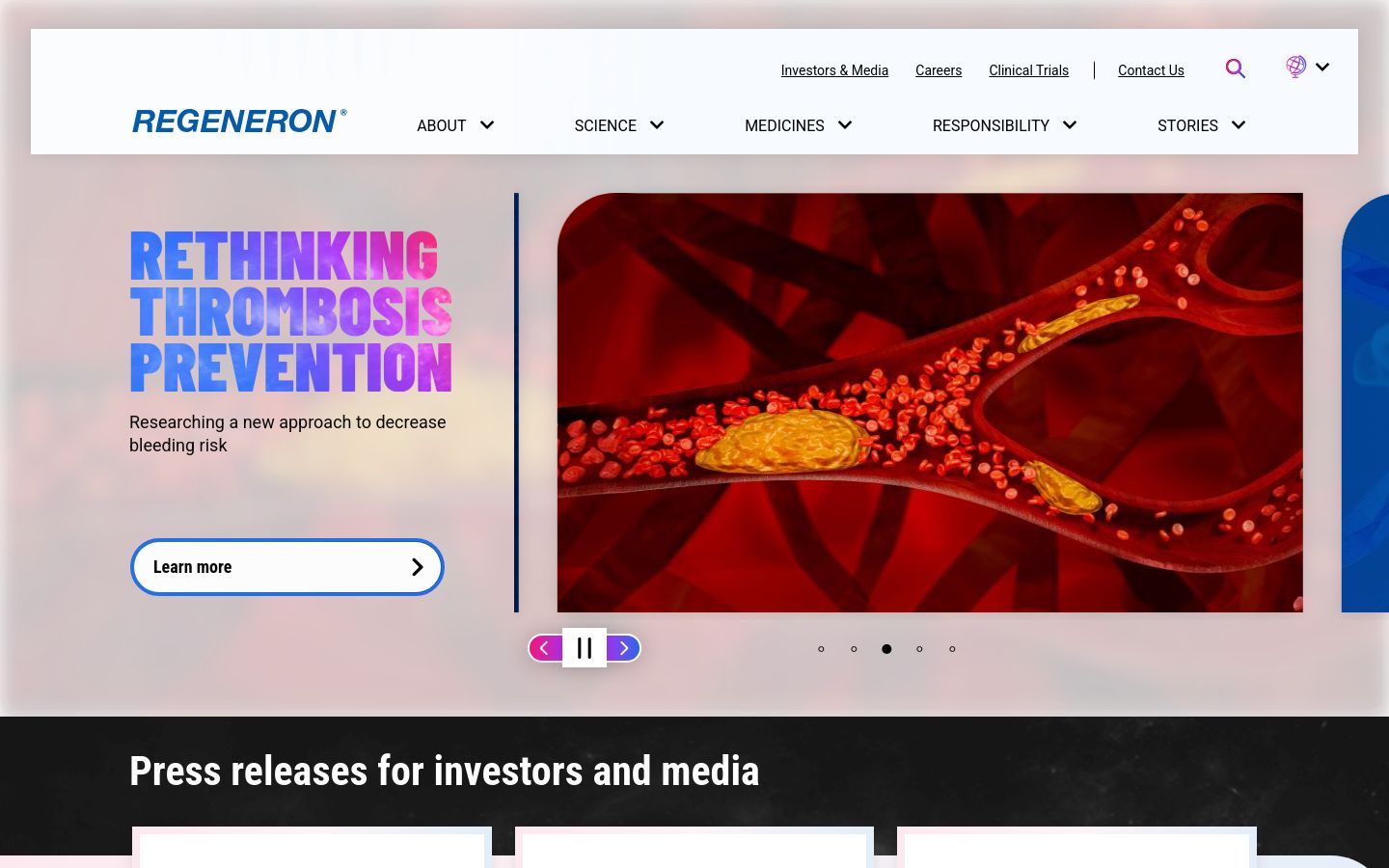
30. Regeneron
Regeneron’s site moves with the company’s R&D culture — confident, dense with science, willing to put publication-grade mechanism content on a marketing page. The IR section in particular is set up like a research library rather than a quarterly-earnings dump, which fits how Regeneron is actually read by the analyst community.
29. Agilent
Agilent runs a deep catalog of life science and analytical instruments, and the site solves the hardest problem in lab-equipment marketing: routing a chromatography buyer, a mass-spec buyer, and a clinical diagnostics buyer to entirely different product universes without making the homepage a directory page. The application-based primary nav is the right call.

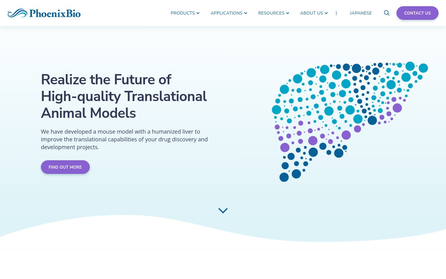
28. PhoenixBio
PhoenixBio’s chimeric-mouse-model business is niche, technical, and hard to explain to anyone outside hepatology. The site solves that by leading with simple custom graphics that frame the model’s utility — what it does, what it measures — before drilling into the science. Motion is used to draw the eye, not for its own sake.
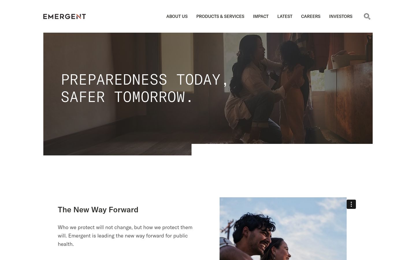
Emergent’s positioning around medical countermeasures (vaccines, treatments for public health threats) is reinforced by a site that refuses to dilute the message — the same slogan and frame appears in the hero, the navigation, and the product cards. Coherent narrative beats clever design here.
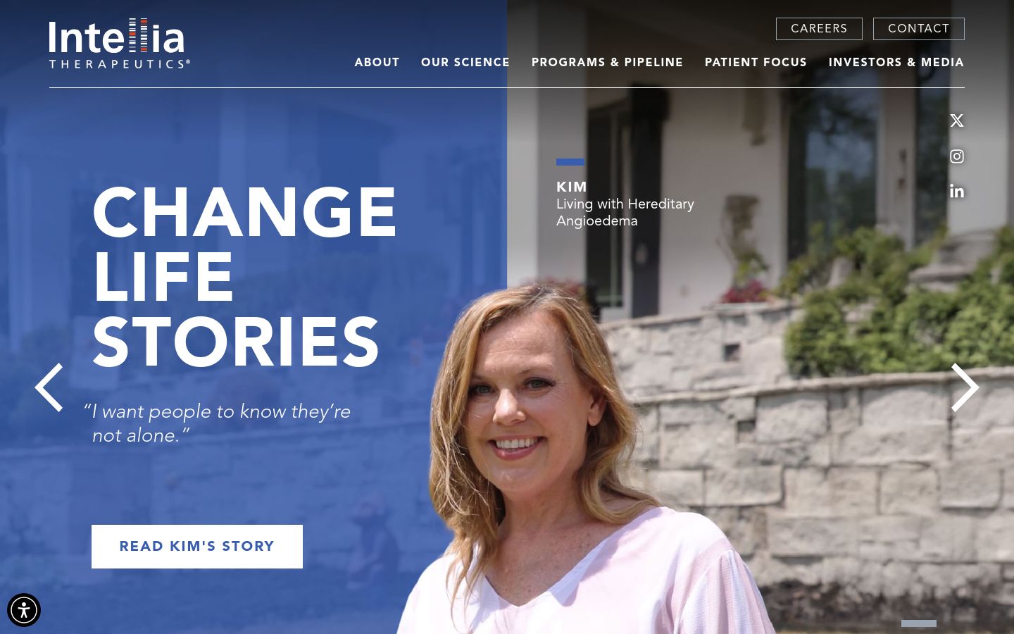
Intellia uses DNA-structure motifs as quiet background accents across the site — never the main event, always the texture. The decision keeps the gene-editing theme visible without forcing every page to scream “CRISPR” at the reader, which is the trap most editing-platform sites fall into.
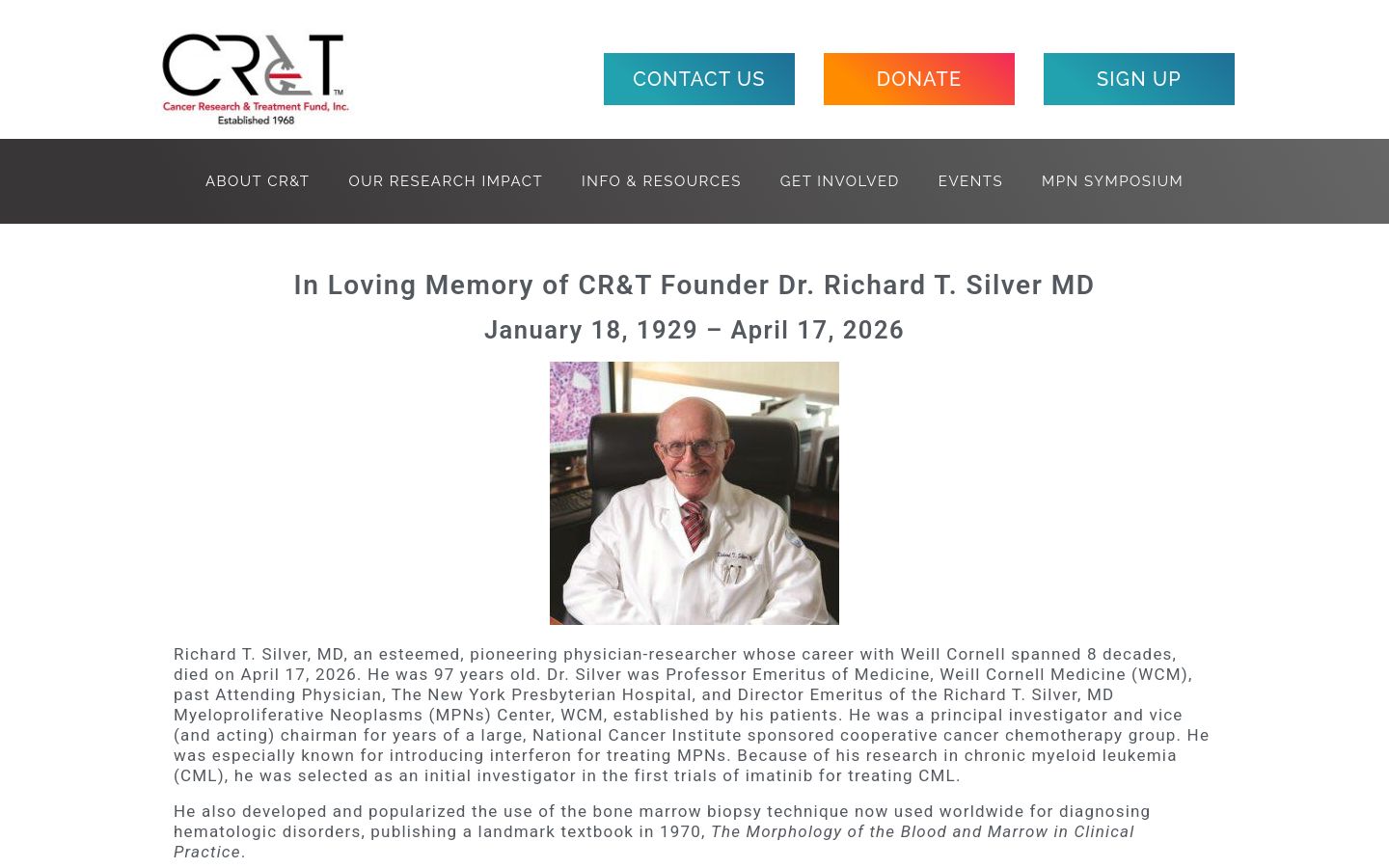
25. Cancer Research & Treatment Fund
CR&T is a nonprofit, and the site is built like a nonprofit should be — clear donate path, named research projects, named outcomes, and a navigation that doesn’t waste a click. The visual restraint is correct; donors want to see where the money went, not a brand video.
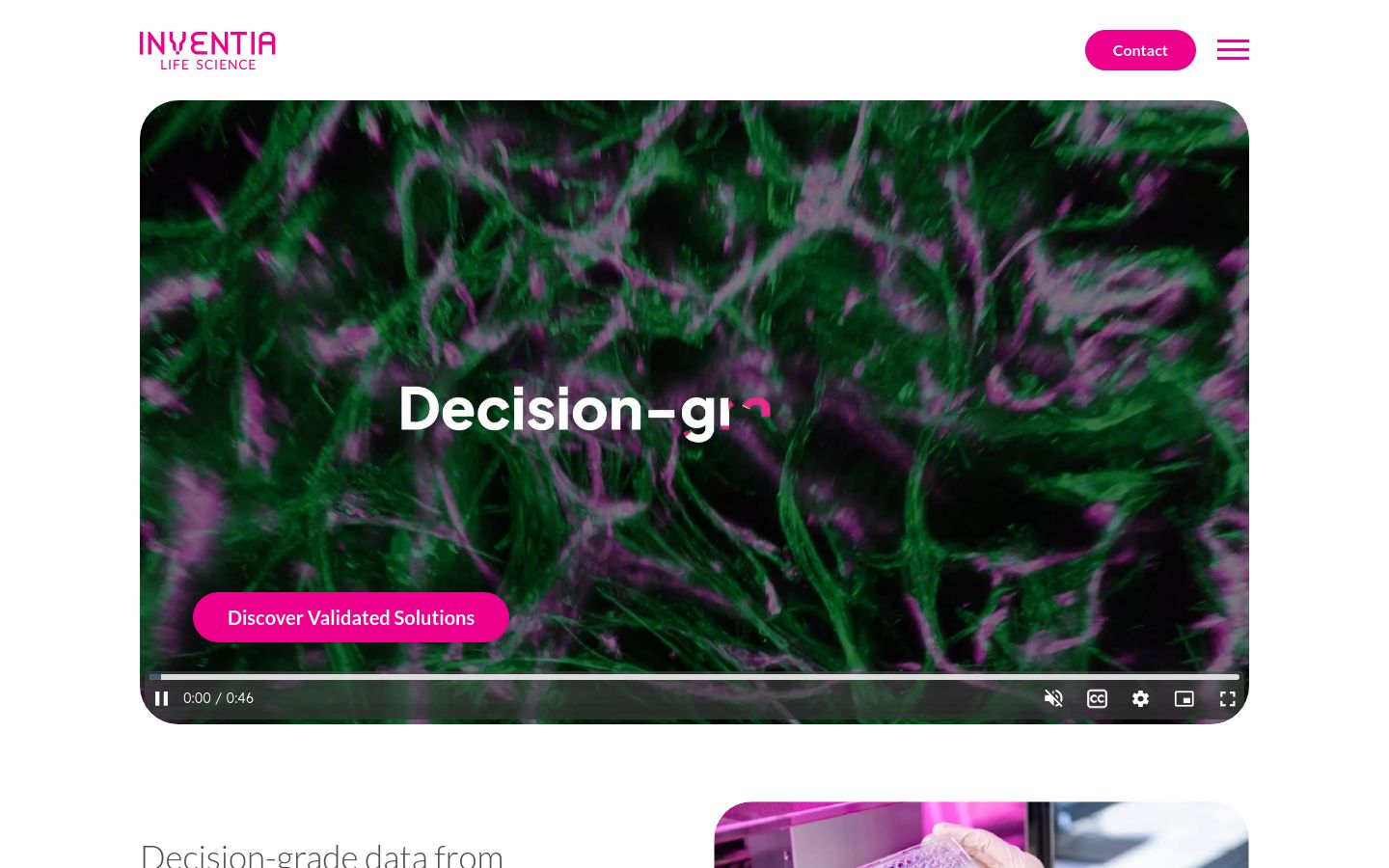
24. Inventia
Inventia’s 3D bioprinting product is communicated through a color system that maps directly to the printed-tissue imagery in the product photography — the brand palette and the product photography share the same hues. That’s a small choice, but it’s the kind of thing that makes a site feel intentional all the way down.
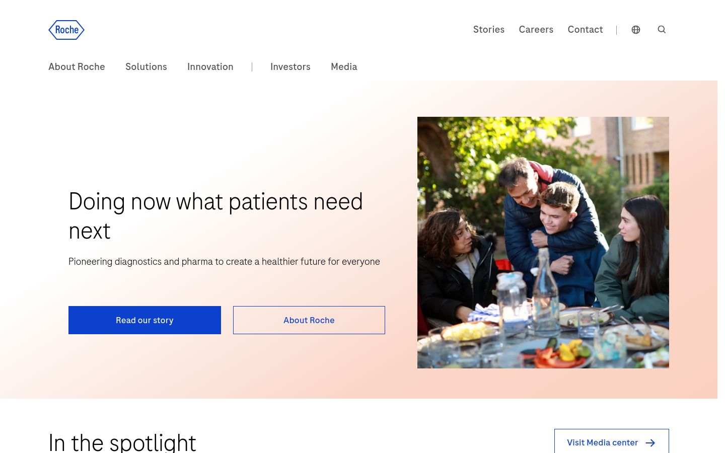
23. Roche
Roche’s site is built to scroll. Every section transitions with a small interactive moment — a graphic that rebuilds, a number that counts up, a chart that reveals — and the cumulative effect is a site that feels alive on a topic (diagnostics + pharma) that usually photographs as static. For a top-five global company, the design ambition is unusual.
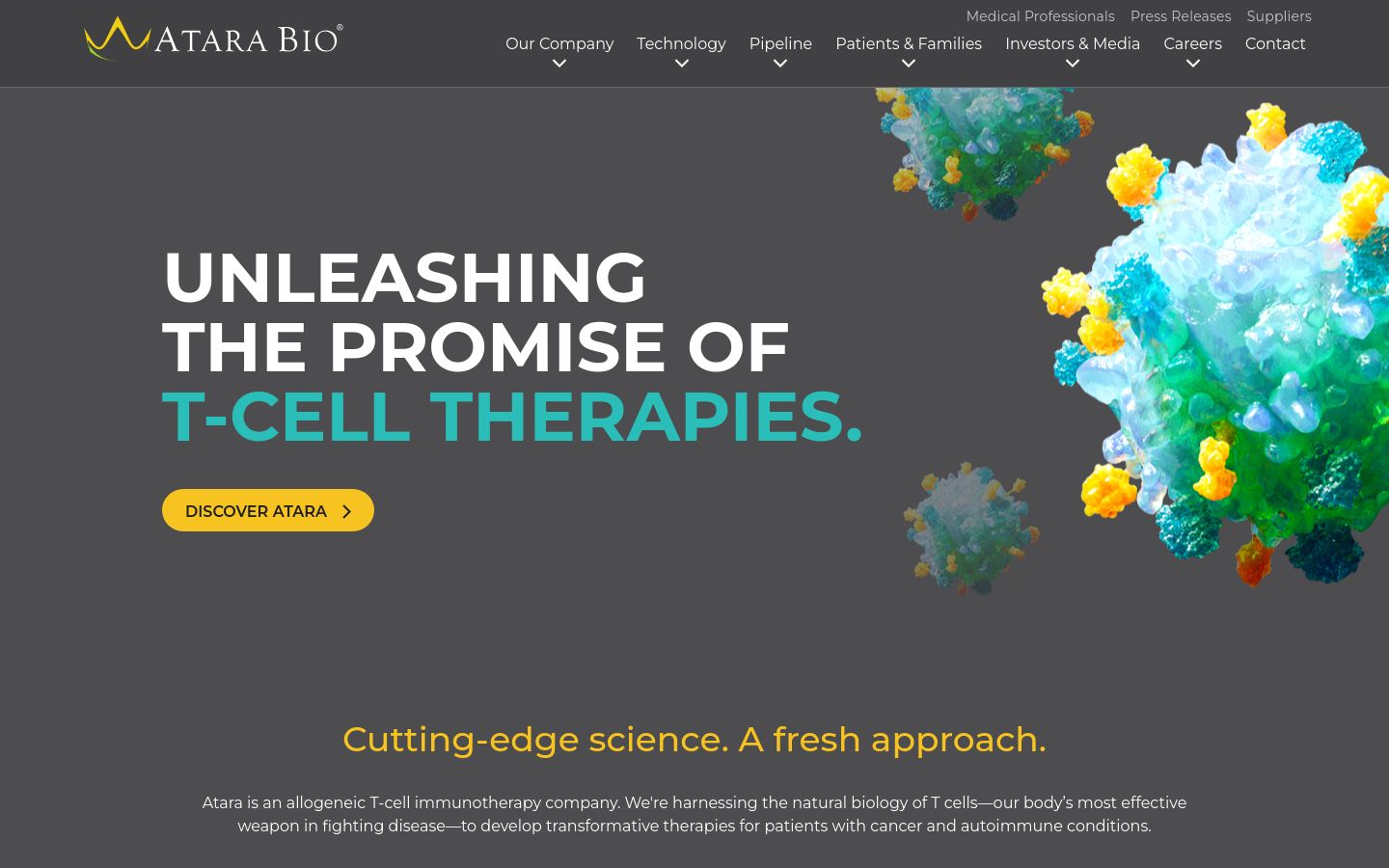
Atara’s T-cell immunotherapy positioning is supported by a color system tuned to the company’s cell-therapy imagery — quiet, cool, slightly clinical. The custom side-margin graphics across pipeline and platform pages are a nice secondary navigation cue most clinical-stage biotechs skip.
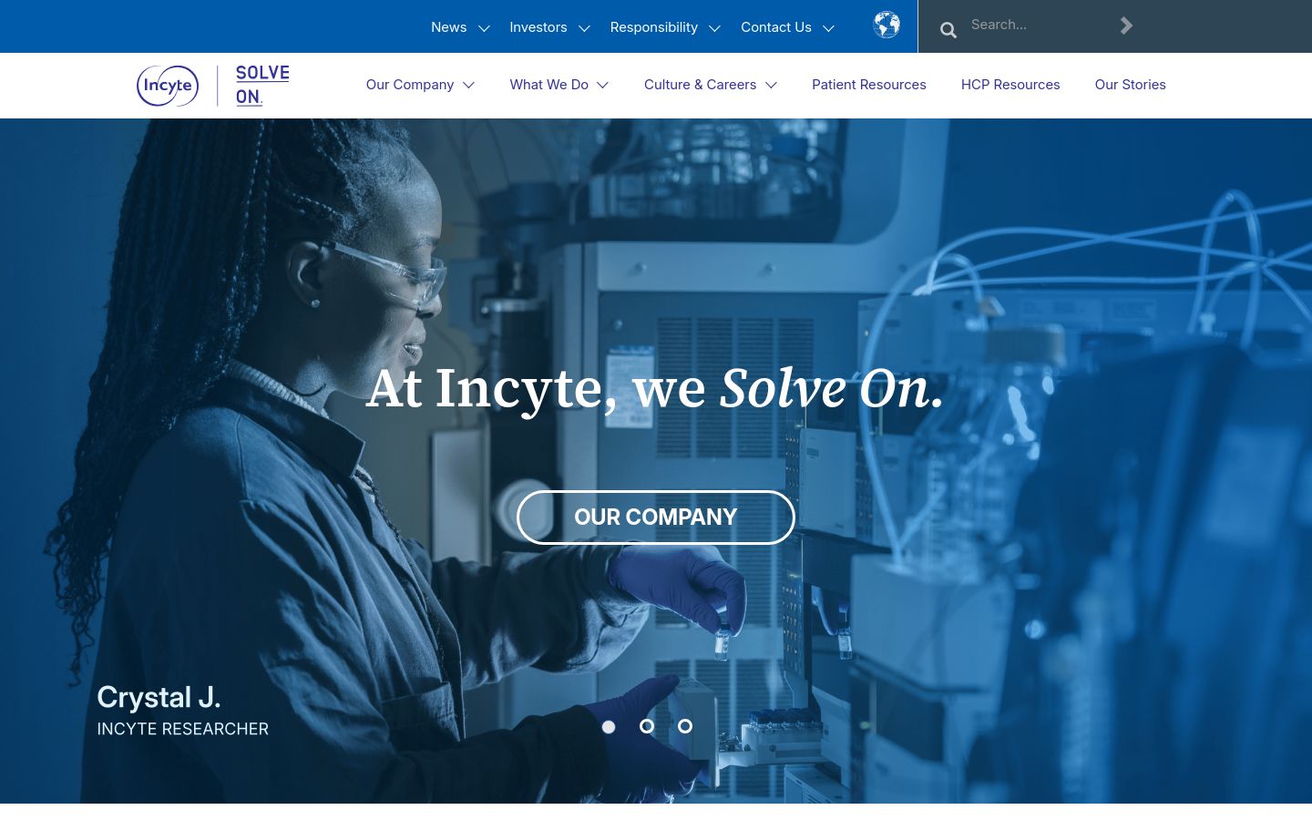
21. Incyte
Incyte’s hero asset is treated more like a film poster than a corporate banner — single focal image, tight typography, no rotating carousel. For an oncology company built around a small number of high-profile programs, the focused hero is the correct visual choice; the carousel approach would dilute the lead asset.
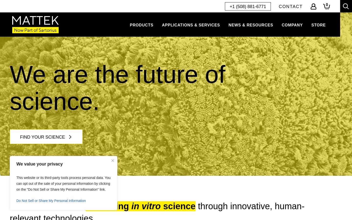
20. MatTek
MatTek sells in vitro tissue models and the site reads like a tools-company site should — application-led navigation, downloadable validation data, named publications using each model. The social proof is concrete (named labs, named studies) rather than logo soup, which is what credibility looks like in this audience.
19. Vertex
Vertex pairs typography with looping background video inside the headlines themselves — text that contains motion. It’s a technique that goes wrong in 90% of executions; Vertex makes it work because the underlying message (cystic fibrosis treatments transforming patient lives) is concrete enough to anchor the motion.

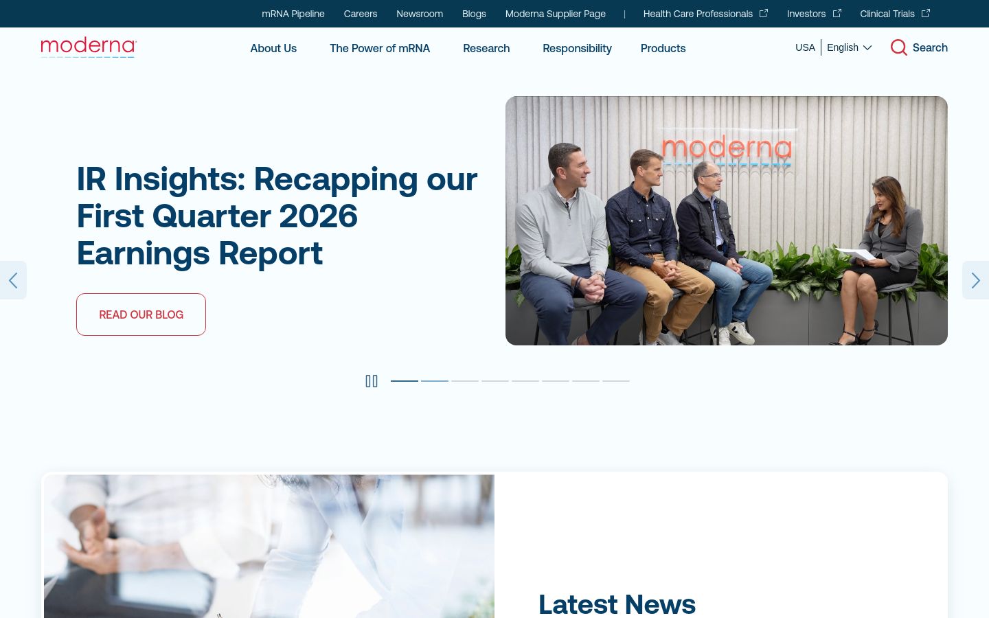
18. Moderna
Moderna’s mRNA platform is communicated through clean infographics and a typographic system that does not feel like a 2020-launched company chasing the trend. The site has the discipline of a much older company while maintaining the design ambition of a much newer one — a difficult balance for a company that scaled so fast.
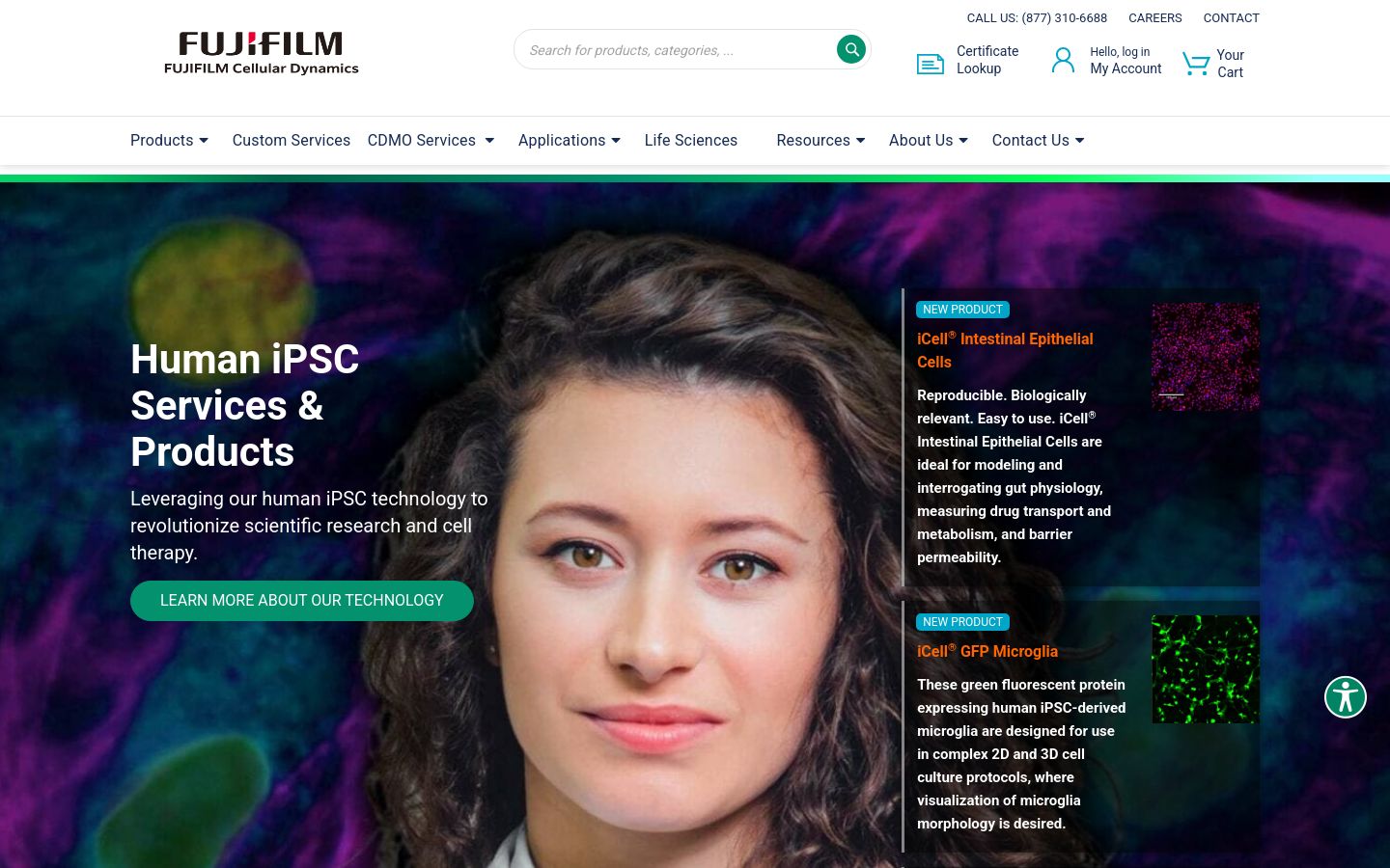
17. Fujifilm Cellular Dynamics
Fujifilm CDI’s iPSC products live in a technically deep, regulatorily complex category, and the site signals that with custom-illustrated application categories — neurological disease, cardiac, oncology — instead of stock cell imagery. The result reads as a tools company that takes its application areas seriously, not a corporate sub-brand.
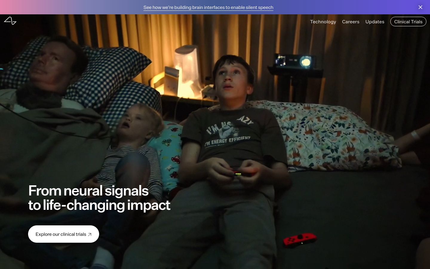
16. Neuralink
Neuralink’s surgical-robot section is a master class in scroll-as-narrative: scrolling reveals the implant component by component, with a single short description per piece. The choice to slow the user down on the hardware story — instead of front-loading hype — is what gives the page its authority.
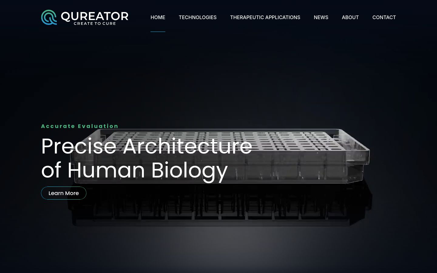
15. Qureator
Qureator’s organ-on-a-chip product is explained through custom illustration and dynamic information overlays — hover or scroll, see the component, see the function. The color system is restrained enough that the science is the visual lead, which is the right hierarchy for a technical buyer audience.
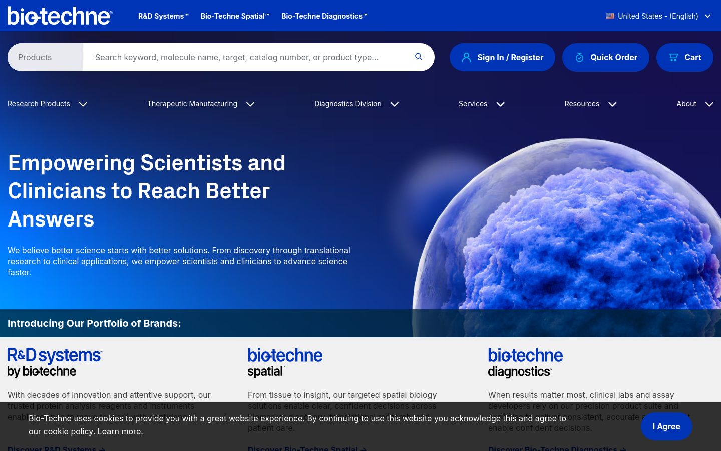
14. Bio-Techne
Bio-Techne sells across reagents, proteins, antibodies, and diagnostics, and the site solves the multi-line problem by treating each business as a distinct visual section while keeping the parent brand frame intact. Cross-line search works. Procurement-relevant content (catalog, certificates, supply chain) is two clicks away from anywhere on the site.
13. AbbVie
AbbVie’s hero uses ambient background video to set tone without competing with the foreground typography — a technique that fails when the video is too busy. AbbVie’s footage is intentionally slow and out-of-focus, which is exactly the right contrast for a site whose primary job is to land a focused message on a serious audience.
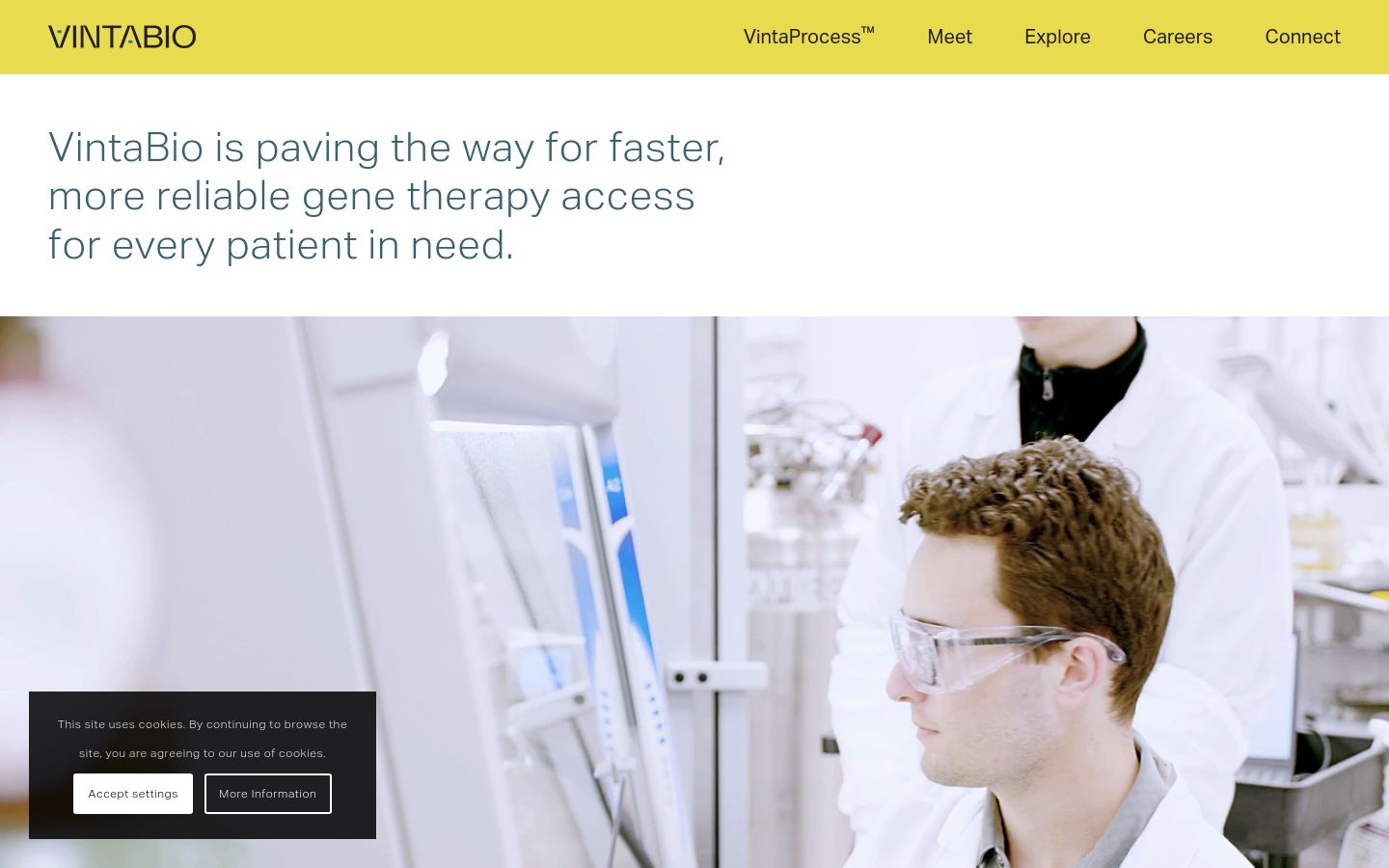
12. VintaBio
VintaBio is a viral vector CDMO and the site does a rare thing for a CDMO: it leads with the team. Photography of the actual scientists, named, with their roles — instead of stock imagery of pipettes — is what differentiates a contract manufacturer in a market where most look identical. The decision earns the trust the category requires.
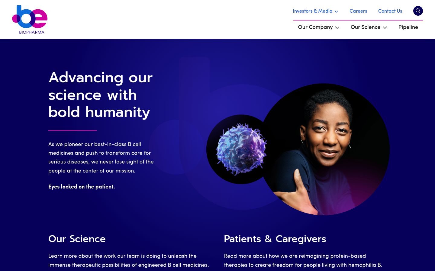
11. Be Biopharma
Be Bio’s engineered B-cell platform is a new modality and the site treats it that way — a hero image rotation that reframes the platform from a different angle every few seconds, plus a strict color discipline that keeps the rotation legible. The palette consistency across pipeline, science, and team pages is unusually tight for a clinical-stage company.
10. Nodexus
Nodexus’s flow-cytometry-adjacent platform is communicated through a moving background that subtly references particle flow — the same metaphor as the science. Color-coded graphics keep the technical content navigable, and the site achieves a rare thing for a startup: it looks like the company has been around longer than it has.

9. Akouos
Akouos (now part of Lilly) keeps a tight three-color palette across every page — and the constraint is what makes the site feel premium. Gene therapy for hearing loss is an emotionally loaded product; the visual restraint lets the messaging land without competing with it.
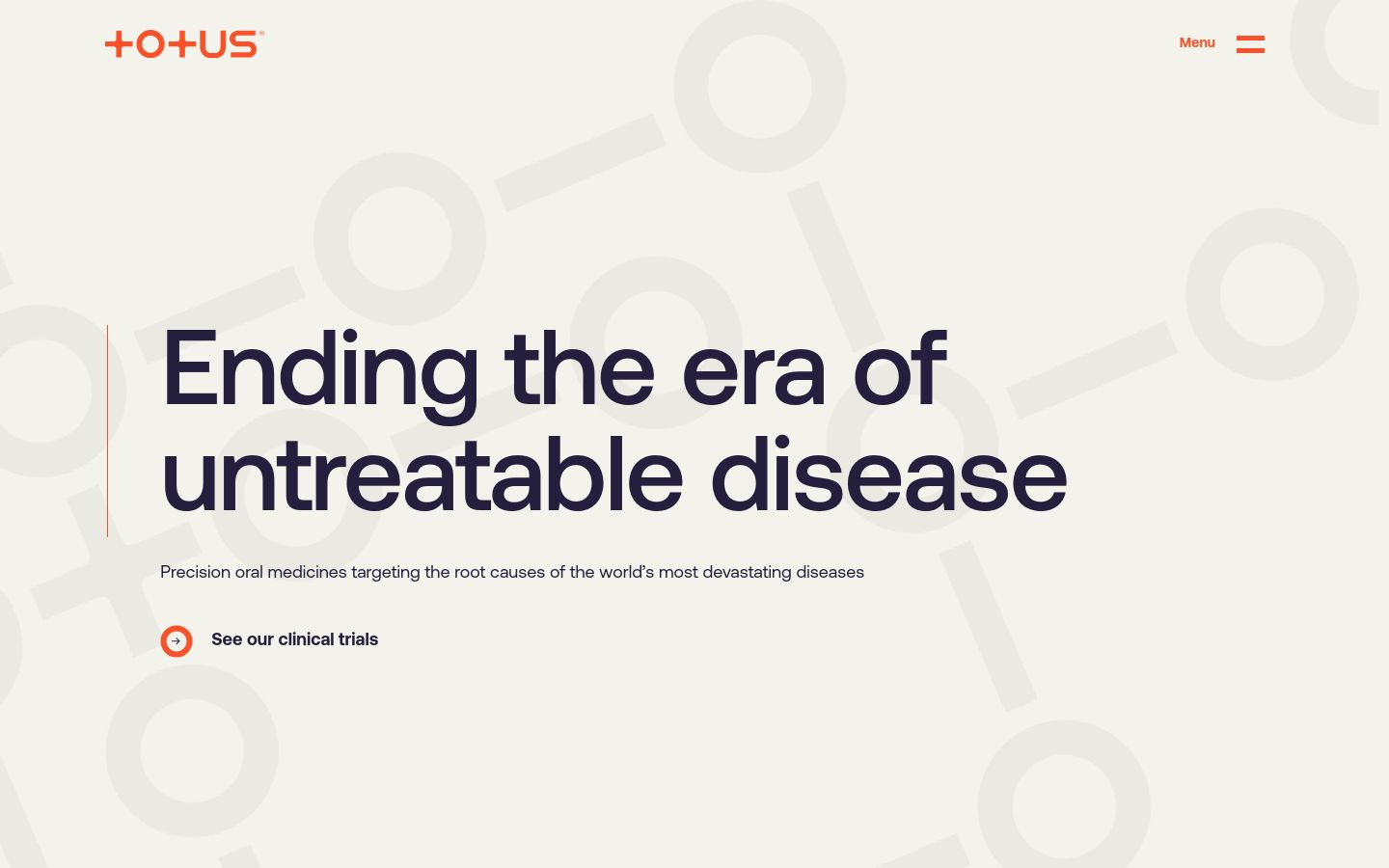
Totus’s covalent-fragment platform is platform science — hard to make visually distinctive. The site solves it with continuously moving but low-key background motion that gives the site visual energy without distracting from the content, plus social proof from named scientific advisors and publications.
7. Wild Biotech
Wild’s microbiome-discovery site uses a deliberately small set of design elements — two or three colors, a single illustrative style, restrained typography — and gets more out of less than almost any biotech in the list. Every element is intentional. Nothing is decorative. That’s the discipline the best startup sites have.
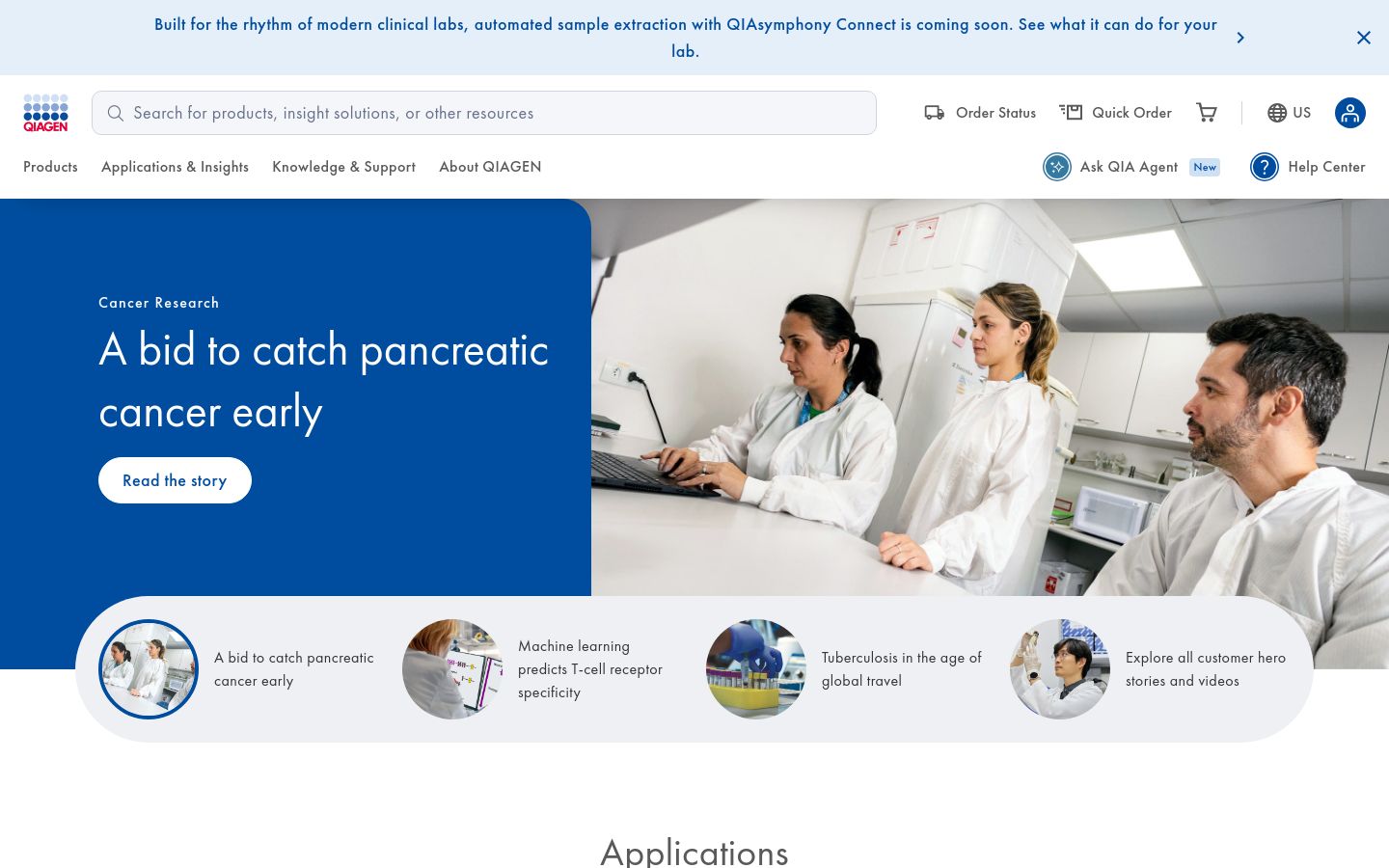
6. Qiagen
Qiagen sells across molecular diagnostics, sample technologies, and bioinformatics, and the site avoids the catalog-overload trap that swallows most multi-line tools companies. Application-led entry points, region-aware product availability, and a clean type system make the site feel coherent across a genuinely huge product surface area.
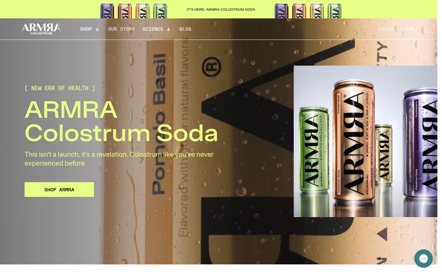
5. Armra
Armra is the only e-commerce site in the top tier of this list, and the site is the reason — colostrum-as-supplement is a category that lives or dies on whether consumers can read the science without feeling lectured. Armra’s product pages stitch peer-reviewed citations into copy that still sells, which is the harder design problem than the visuals.
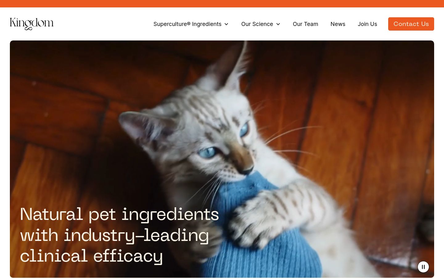
Kingdom’s microbiome-for-food platform is communicated through illustration so distinctive it could anchor a children’s-book brand — and the audacity is the point. Most food-tech and consumer-biotech sites converge on the same earnest-but-bland visual language; Kingdom’s choice to look completely different is the design move that earns the top-tier spot.
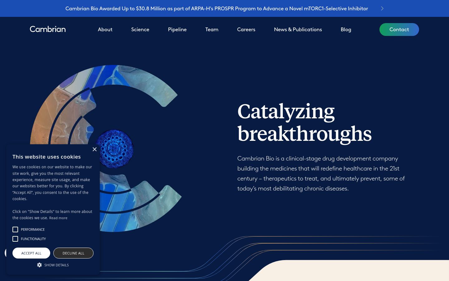
Cambrian’s longevity-platform site is built around quiet gradient transitions and minimal motion — and the discipline is what makes it feel premium. There are no flashy animations, no scroll-jacking, no carousel. The site is confident enough to stand on typography and color, which most biotechs in the longevity space cannot resist over-designing.
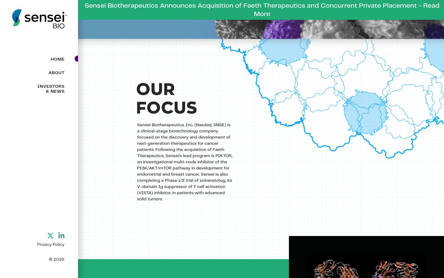
Sensei’s site delivers the rarest thing in clinical-stage biotech web design: a mission statement that lands inside the first second of looking at the page. The custom-graphic system pulls the eye to the message, the type system gets out of the way, and the rest of the site holds the same hierarchy from pipeline through investor materials.
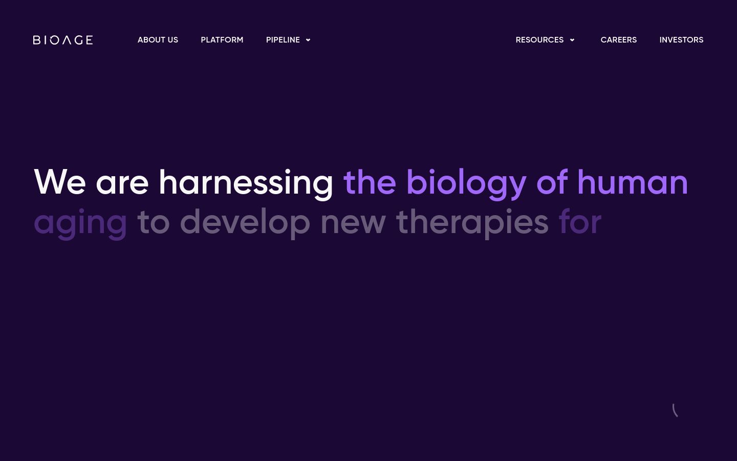
1. BioAge Labs
BioAge ranks first because the site does everything the top tier of this list does — restraint, custom illustration, scroll-linked motion that earns its keep, premium type discipline — and one extra thing: the design choices feel earned by the science. Aging biology is abstract; BioAge’s 3D motion gives the abstraction a shape that’s specific to the company without being literal. Every part of the site feels like the same company made the same decisions across every page.
What separates the top 10 from the rest
Three patterns held across the highest-ranked sites and broke down further down the list.
Restraint. The top sites do less, with more discipline. Two colors instead of six. One illustrative style across every page. Motion only where it earns its keep. The lower-ranked sites are not worse-designed in isolation — they’re less consistent. Restraint is the visible signal of an internal team (or agency) that says no.
Hierarchy that matches buyer intent. A clinical-stage therapeutics site that sells to investors should not bury the pipeline two clicks deep. A diagnostics tools site that sells to lab buyers should not force them through a corporate news menu. The top sites in this list start with the question of who is reading and design the homepage for that person; the lower-ranked sites start with the company org chart and design for that.
Technical execution that survives the AI layer. In 2026, AI search engines are the first read on most biotech companies. Sites with server-rendered key claims, clean schema, and structured pipeline data get cited in AI Overviews and chatbot answers; sites that hide their science behind client-side JavaScript do not. Several of the top entries above were rewarded for this in the ranking.
Hire us to build the next one
If your site is on this list and you are reading it thinking it could rank higher — or your site isn’t here and you want to know what it would take — that’s what we do. Digital Elevator is a biotech web design agency with nearly 15 years of work across therapeutics, diagnostics, lab tools, and consumer biotech. Our work spans biotech-specific marketing, AI visibility, technical SEO, and conversion-optimized UX for life sciences companies that need a site that earns the next round.
Book a discovery call and we’ll walk through the design choices that would move your site up this list next year.

Founder and CEO of Digital Elevator. 15+ years of marketing experience helping businesses compete and win online, from emerging startups to Fortune 100 leaders.