// Case study
BronchMatrix
Web Design Brand Guide Custom Infographics Vendor Asset Sourcing

BronchMatrix (Pulmonary Solutions) is a medical device company that distributes one product: ClearTip TBNA, an endobronchial ultrasound-guided needle used by pulmonologists to sample lymph nodes during bronchoscopy. The device is made by FINEMEDIX. BronchMatrix brings it to clinicians.
BronchMatrix needed to look like an established medical device company, the kind a hospital’s purchasing committee takes seriously, when it had almost nothing to work from. There was no brand guide, no product photography, no written specifications, and very little copy. A thin site would read as a thin company, and in medtech that costs you the meeting.
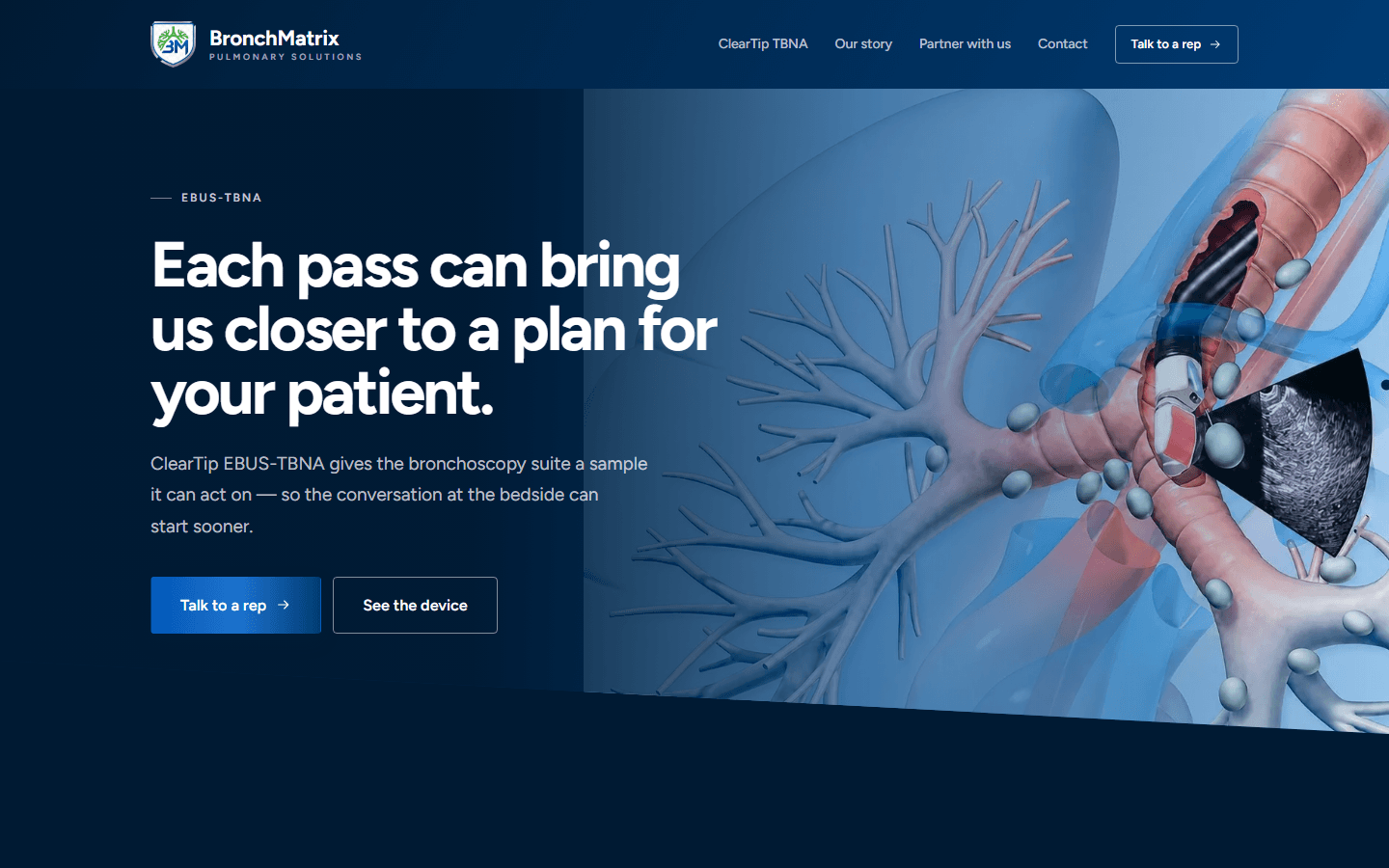
When the client can’t supply the content, find who can. BronchMatrix’s strongest asset was its relationship with the manufacturer, so we worked through it. From FINEMEDIX we sourced the full specification table for all twelve ClearTip models: gauges, sheath materials, working lengths, and the scope configurations each one pairs with. We also sourced the product imagery and the official indications and safety document.
That material became the core of the site: a product page with tabbed specifications, ordering information, and downloads, plus a filterable twelve-model matrix that lets a clinician find the exact configuration for their scope. Every figure comes directly from the manufacturer’s table, and anything we didn’t have is labelled as not yet available instead of made up.
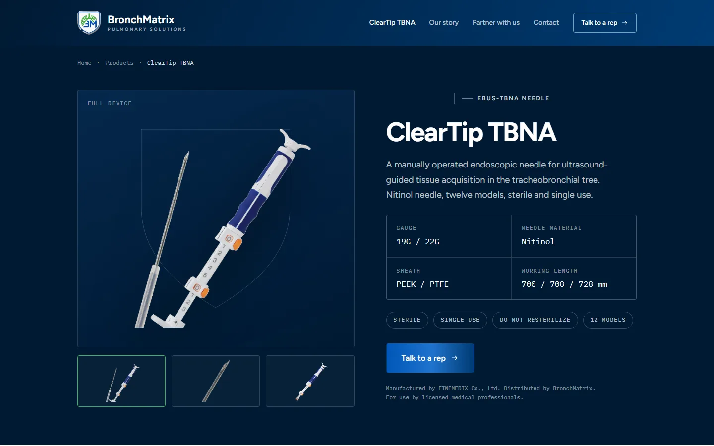
A single-product company risks looking like a single-product website. To show the depth behind the device, we designed custom infographics. The centerpiece is a diagram with the BronchMatrix mark at the center, ringed by everything that comes with the product: scope compatibility, evaluation units, case support, clinical education, ordering and logistics, sterile single-use packaging, depth control, and direct rep access. Instead of one needle, visitors see a company that stands behind it.
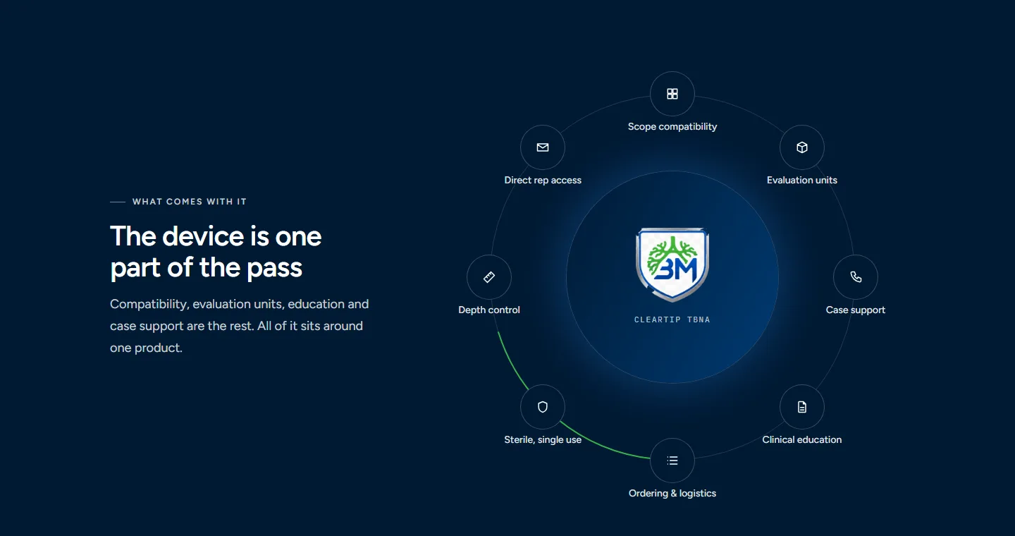
The diagram is built as live code, not a flat image, so it stays sharp at any size. On phones it becomes a simple list, where the ring would be too small to read.
We wrote BronchMatrix’s brand guide from the ground up. It covers the color system, the blue-to-green gradient and the strict limits on its use, the Figtree and IBM Plex Mono type pairing, spacing, elevation, and motion. It also defines every interface component, from buttons and alerts to spec tables.
Just as important, the guide sets the content rules a regulated company needs:
Those rules make the site look corporate, and they also keep it compliant as it grows.
BronchMatrix launched on Astro, deployed to the Cloudflare edge, as a five-page site that reads like an established medtech brand. It has a complete brand guide, a documented twelve-model product line, and structured data limited to what the site actually states. It ships no framework JavaScript, so pages load fast, even the homepage with its full-bleed hero image. The company went from minimal content to a brand it can put in front of any hospital.
Every case study started with a conversation. Tell us about your goals and we will show you what we can do.
Transparent pricing. Scope agreed before we start.