The marriage of your blog’s layout and design may be one of the most critical factors in keeping your visitors engaged with your content.
With over 6+ million blog posts published each day globally, you’ll need to take advantage of every opportunity you have to evoke as much credibility and trust from your blog as possible.
As a company that has driven millions of dollars of traffic value to our clients through our blogging efforts, I wanted to share the secret sauce to winning blog layout and design that we’ve learned from working on sites for over a decade.
Below you’ll find our exact processes for layout and design for the following:
- Blog hub page
- Blog category page
- Author page
- Blog post
Blog Hub Page Layout & Design
The blog hub page is probably the most overlooked blog design aspect. Most sites simply use the default WordPress settings of displaying blogs in reverse chronological order. While there is nothing inherently wrong with that approach, we like to set up blog hub pages to cater to interests, or defined in a different way, to cater to buyer personas.
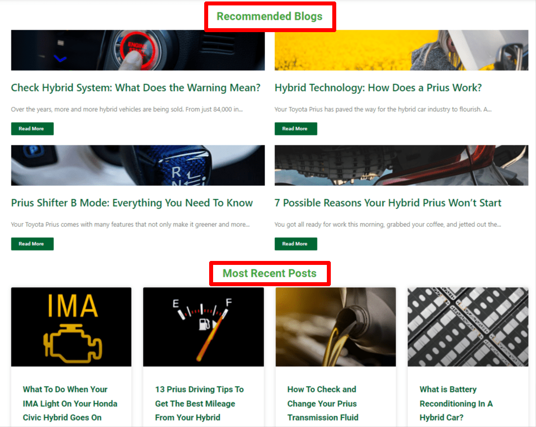
A good example of this blog hub page layout in action is the Exclusively Hybrid blog. The blog caters to several different buyer personas, all largely related to hybrid batteries: Recommended blogs (to emphasize the most popular blogs on the site); most recent posts (for timely content); and categorial sections around topics such as Hybrid Maintenance, Technology, and specific brands of hybrids.
When readers are in what is called “content consumption mode,” this blog hub layout gives them the best opportunity to digest a specific topic in its entirety, lending credibility to the brand, educating, and pushing toward sales.
When designing a blog hub this way, you’ll see a lot of thought go into content curation. When you logically think about the specific topics you want to delve into repeatedly, it is easy to create these curated sections that appeal to specific buyers.
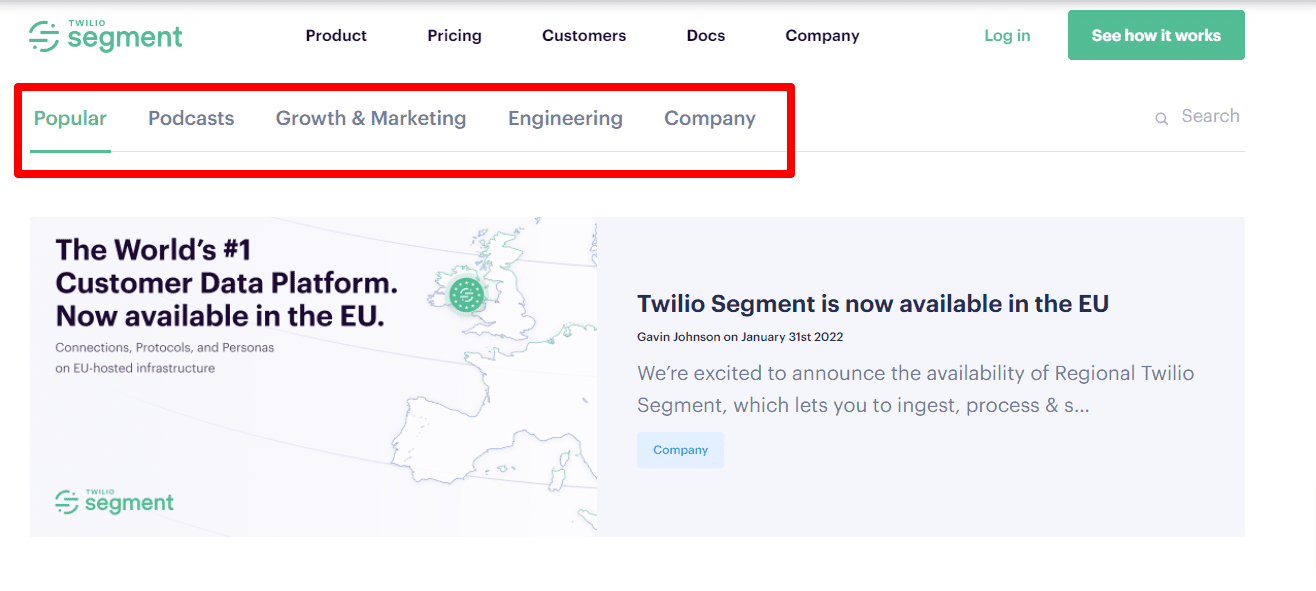
Another company that does this well is Segment. They provide a sub-menu of the types of content they create right up top, offering a different approach to categorical navigation than the example above.
I also like that they have blog newsletter CTAs throughout the page to encourage signups.
Blog Hub Page Design SEO Best Practices
- Ideate primary categories based on content marketing
- Recommended - 3-6 blogs
- Include blog email opt-in or relevant CTA (ex. demo)
- Recent - 3-6 blogs
- Category A - 3-4 blogs
- Category B -3-4 blogs
- etc
- All categories need a View More button to jump to the category URL
- Decide on Featured Image art direction (also serves as hero)
- Standard corporate images?
- Custom images?
Blog Category Page Layout & Design
For blogs that have a decent amount of content for each category, dedicated category pages are recommended to capitalize on specific categorical interests.
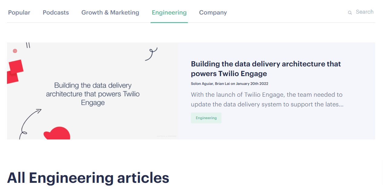
For Segment, this means creating a page around something like Engineering:
https://segment.com/blog/engineering/
This serves the Engineering buyer persona well since they would be unlikely to have interest in Segment’s Growth & Marketing content or vice versa.
The blog category pages should also follow Segment’s approach of providing some contextually relevant content, as the page does with a keyword-researched blurb that talks about what the page is promoting.
Blog Category Page Design SEO Best Practices
- Create categories driven by keyword research
- Include category description: 1-2 sentences of copy that describes the category
- Recommended section of curated content
- Recent content
Author Page Layout & Design
While I will admit not every website requires as much emphasis on the credibility of its authors as those in YMYL industries, Google has made it clear that its recent core updates do put a lot of emphasis on authorship, credibility, and trust.
With these E-A-T benchmarks in place, we feel that most blogs benefit from author pages that showcase Expertise, Authoritativeness, and Trustworthiness.
These pages don’t have to be massive productions, but they are an opportunity to brag about one’s prowess in an industry. We find that Google (and visitors) find credibility in third-party, trustworthy websites. For example, medical doctors who other medical sites have featured, authors who appear on the sites of popular conferences with links to their blogs, etc.
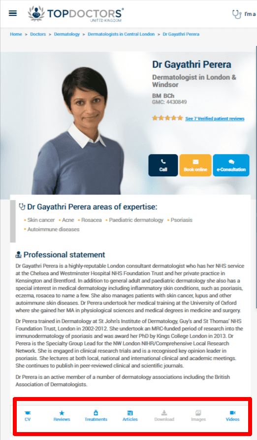
This article from Search Engine Journal provides a great author bio page for E-A-T and references this particularly amazing bio of Dr. Gayathri Perera, a dermatologist in London.
Check out the aforementioned SEJ link for more details and some of our best practices below.
Author Page Design SEO Best Practices
- Assign all posts to the author, not generic company posts
- Include bios even with single author sites
- Include information in bio such as: education, group membership, publications, certifications, other media mentions, etc - anything that qualifies them to be an authority in their field
- Headshots
- Links to social accounts
- Reviews
- Links to third-party websites that reference the author
- Schema markup
Blog Post Layout & Design
The layout and design of your blog post are really where the meat and potatoes of your efforts are likely to go. And this is probably where the bulk of your website traffic comes from if done correctly.
The following recommendations are by no means a blog post design bible, as every brand will have slightly different style guidelines, personal preferences, and artistic direction. However, these recommendations are provided with SEO in mind, so take what you’d like and leave what you don’t.
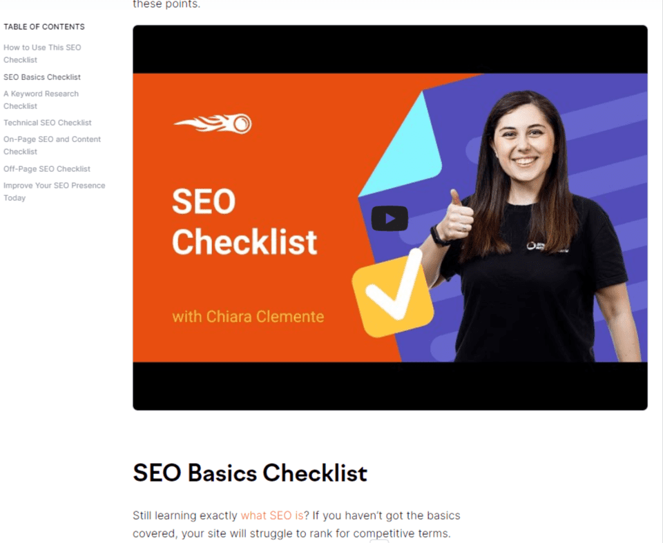
To delve into this, it’s nice to start with an example, and SEMRush blog post design comes through as a winner in this department.
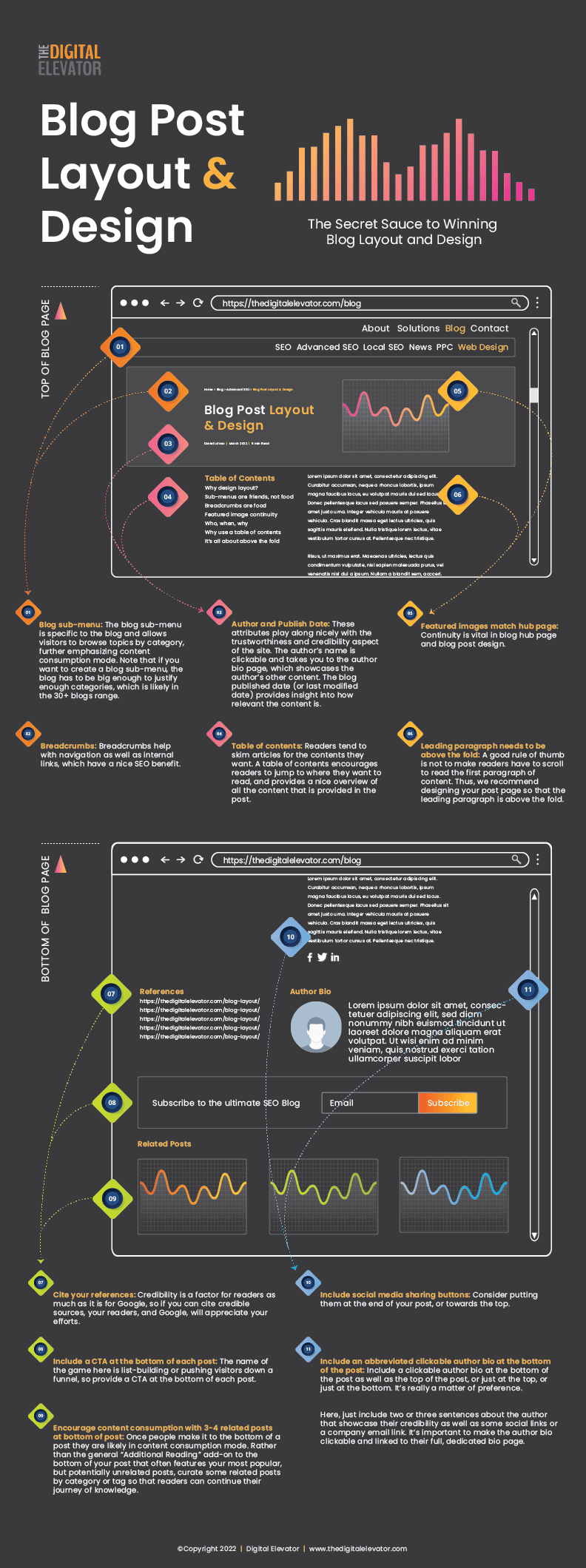
- Blog sub-menu: Playing with our categorization on the blog hub page, the blog sub-menu is specific to the blog and allows visitors to browse topics by category, further emphasizing content consumption mode. Note that if you want to create a blog sub-menu like this, the blog has to be big enough to justify enough categories, which is likely in the 30+ blogs range.
- Breadcrumbs: Breadcrumbs also help with navigation as well as internal links, which have a nice SEO benefit.
- Featured images match hub page: Continuity is vital in blog hub page and blog post design. Here, we will find that SEMRush’s featured image matches that of their blog hub page.
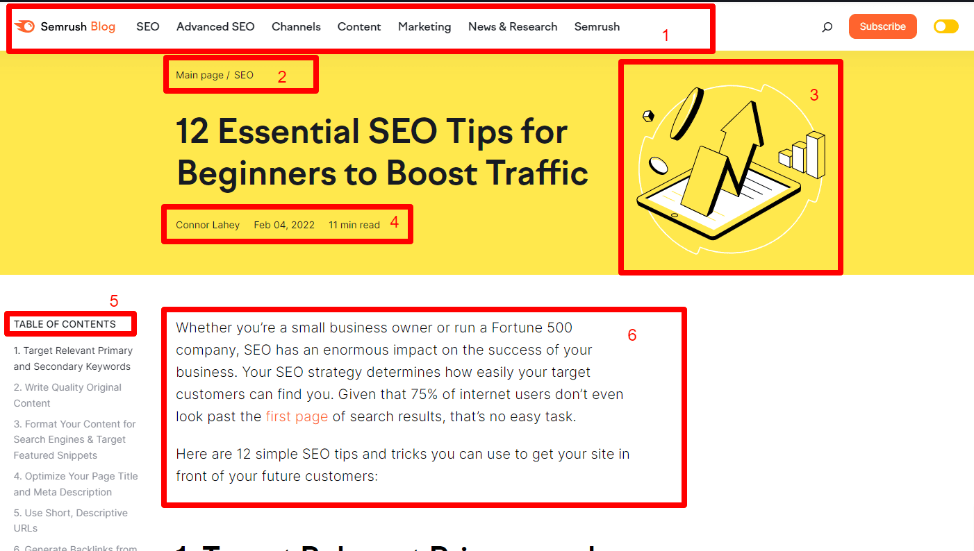
- Author, Publish Date, Read time: These attributes play along nicely with what we spoke about before with the trustworthiness and credibility aspect of the site. The author’s name is clickable and takes you to the author bio page, which showcases the author’s other content. The blog published date (or last modified date) provides insight into how relevant the content is. If the content is evergreen, there may be a case to not showcase the publish date. Finally, the read time may be an attractive piece of information that we are seeing used more in blogs. Not shown in the screenshot, but used on the SEMRush blog, is progress reading bar. This is a subtle bar that moves across the page to show you how much more content you have left to complete which may increase completion of reading and decrease bounce rate.
- Table of contents: We know that today’s readers tend to skim articles for the contents they want. A table of contents encourages readers to jump to where they want to read, and provides a nice overview of all the content that is provided in the post. We like SEMRush’s table of contents because it floats as you scroll, but there are other options available such as this one from LuckyWP.
- Leading paragraph needs to be above the fold: A good rule of thumb is not to make readers have to scroll to read the first paragraph of content. Thus, we recommend designing your post page so that the leading paragraph is above the fold.
Additional Blog Post Layout SEO Best Practices
Create a style guide around video placements
Because many blogs also include video, it makes sense to create a style guide on how your blog post will display them. Some ideas are:
In-body with thumbnail
Lightbox with CTA box
In the featured image overlay
(ex. guy on cliff in the SEMRush screenshot replaced with thumbnail with embed)
Place social media sharing buttons according to sharing prominence
The degree to which you emphasize social media sharing greatly depends on the nature of your industry. In some industries, social sharing is very popular (think recipes) while in others, like engineering, it is less prevalent.
Depending on the degree of which social sharing is used within your industry should drive the prominence of your social sharing icons.
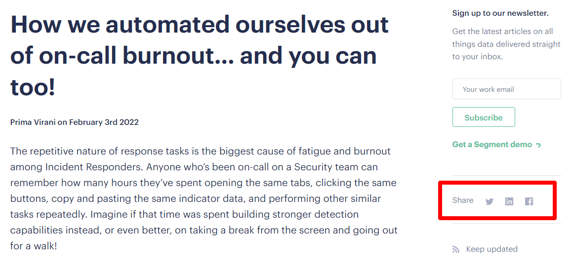
For example, for Segment and their engineering content, these subtle, right sidebar, non-scrolling social sharing icons suffice.
You can also consider putting them at the end of your post, or towards the top.
Breakup text for increased readability with HTML elements
No one likes to look at a bunch of text with no end in sight. Besides the obvious use of visuals to breakup lines of text, utilize unique HTML elements such as the following:
- block quotes
- tables
- custom icons for bullets/checkmarks
- encapsulate important elements (ex. branded box with paragraph text)
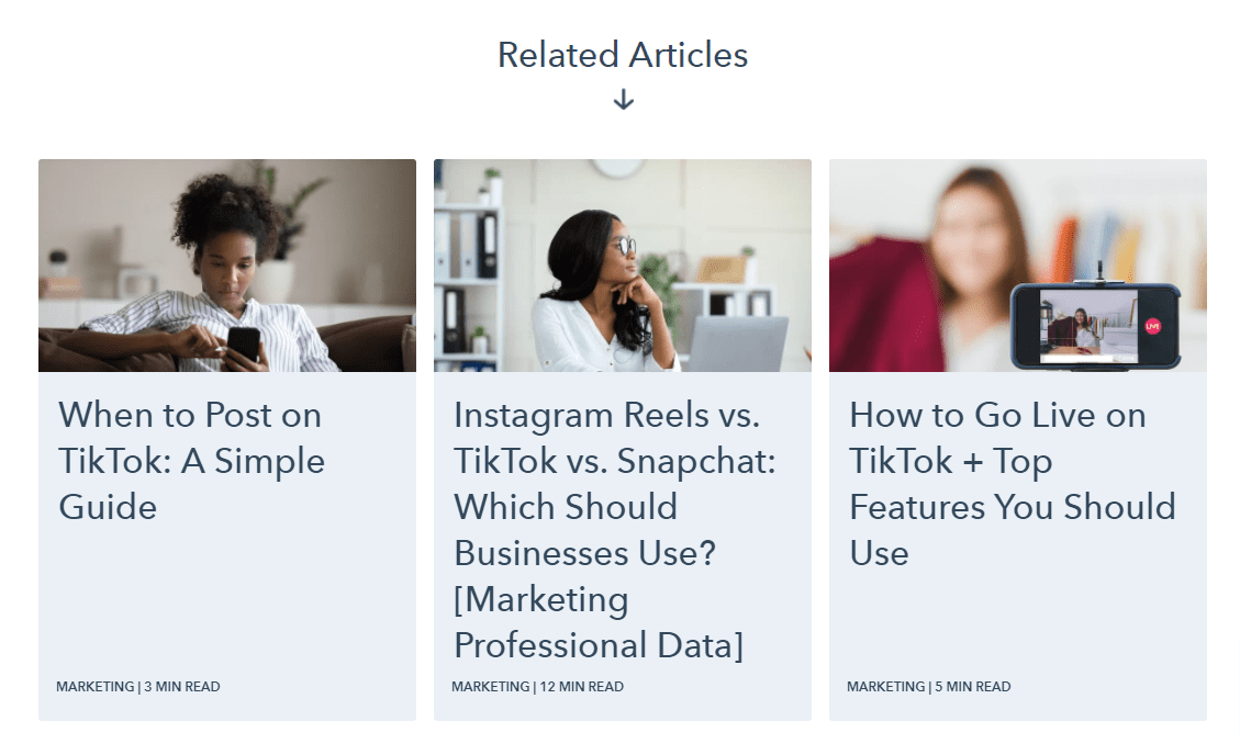
Encourage content consumption with 3-4 related posts at bottom of post
You’ve probably seen HubSpot do this with their blog posts really well. Why? Because HubSpot knows that once people make it to the bottom of a post they are likely in content consumption mode.
If you want Cookie Monster to hang out with you, what do you do? Give him more cookies!
Rather than the general “Additional Reading” add-on to the bottom of your post that often features your most popular, but potentially unrelated posts, curate some related posts by category or tag so that readers can continue their journey of knowledge.
Here’s an example of an article on YouTube Comments that ends with three related articles on HubSpot’s site:
Include a CTA at the bottom of each post
Again, this is a space that HubSpot is well-known for, particularly as it applies to very specific CTAs.
Not only do they put this CTA at the end of the post, but they also have CTAs in-body and as slide-ins. All these CTAs may be a bit overkill for most brands, but if the name of the game is list building, then there is definitely a lesson to be learned here.
If you have an existing CTA in your footer as a global setting, make sure the CTAs don’t conflict.
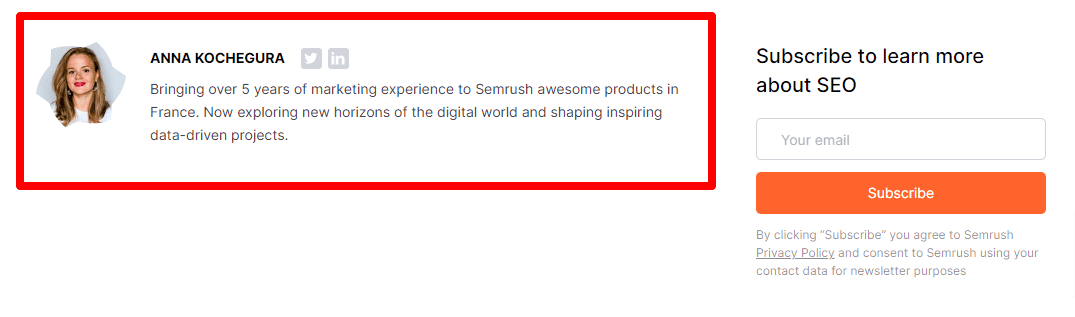
Include an abbreviated clickable author bio at the bottom of the post
Like SEMRush, you can include a clickable author bio at the bottom of the post as well as the top of the post, or just at the top, or just at the bottom. It’s really a matter of preference.
Here, just include two or three sentences about the author that showcase their credibility as well as some social links or a company email link. It’s important to make the author bio clickable and linked to their full, dedicated bio page.
Blog comments should be considered on a site-by-site basis
There seems to be a trend with many blogs to not include the option to leave comments at the bottom of blog posts. For anyone who has ever managed a blog, handling spam is an obvious reason to do away with this type of social engagement.
However, there are some research studies that show that comments can drive traffic, provided the community is highly active.
The bottom line from this research is that comments can be nice to have, but are not an absolute necessity for SEO gains.
If you are thinking about including comments on your blog posts, consider the following first:
- Do you have someone in-house who can spend time moderating, replying, and managing comments in a meaningful way?
- Will your blog justify enough comments to include this type of engagement?
- Will the comments actually provide value to the blogs?
Another consideration for blog comments is to push comments to a membership-based community, such as verified subscribers, or a Facebook group.
Cite your references
Last but not least, make sure to cite your references. Here’s what Google has to say about that:
It should go without saying that scientific articles and authoritative sites are very important for credibility for YMYL websites, but not as much with general information sites. Still, credibility is a factor for readers as much as it is for Google, so if you can cite credible sources, your readers, and Google, will appreciate your efforts.
Working With Your Dev Team to Make Changes
If you have made the smart decision to implement the above changes to your blog you may be wondering where to start or be concerned about the work involved.
The good news, if you are on WordPress, is that the page builders – Brizy, Elementor, Divi, Muffin Builder, etc. – all come with templates. When you approach blog hub pages, category pages, or blog post pages, a template can be used to create the design and layout that matches your brand.
Since this is more of an SEO guide to blog layout and design we won’t go into detail about how to go about this as any decent developer can carry this out. That said, it does provide an opportunity for a shameless plug to use Digital Elevator to design, plan, and carry out these changes for you with our touch of SEO expertise.
If you need help carrying out the recommendations of this post, reach out to us today.

Founder and CEO of Digital Elevator. 15+ years of marketing experience helping businesses compete and win online, from emerging startups to Fortune 100 leaders.