
The desire for more software across collaborative, remote, and hybridized workforces has been great for the SaaS industry in recent years.
Gartner has forecasted end-user spending on cloud-services to grow 21.7% from 2021 to 2022, highlighting the demand in the marketplace and inherent competitiveness that comes along with it.
Arguably, the core of this competitive landscape lies in your SaaS’ digital presence, further underscored by the attractiveness and effectiveness of your SaaS website.
Let’s look at some of the best SaaS websites with our own internal scoring system looking at design, rankings, and traffic. I’ve broken down the best SaaS sites into two buckets, one that primarily serves the enterprise market and one that primarily serves SMBs.
Best SaaS Websites Serving the Enterprise Market
We have distinguished SaaS websites that cater to the enterprise market and SMB market because they tend to have a different look and feel. As you’ll see in these examples below, the enterprise-facing SaaS websites tend to be a bit more sterile, less risky with their color schemes and aesthetics, and somewhat predictable in their layouts.
They are all beautifully-designed sites in their own right, but we’ll see more variation in design when we get to the SMB market.
Salesforce
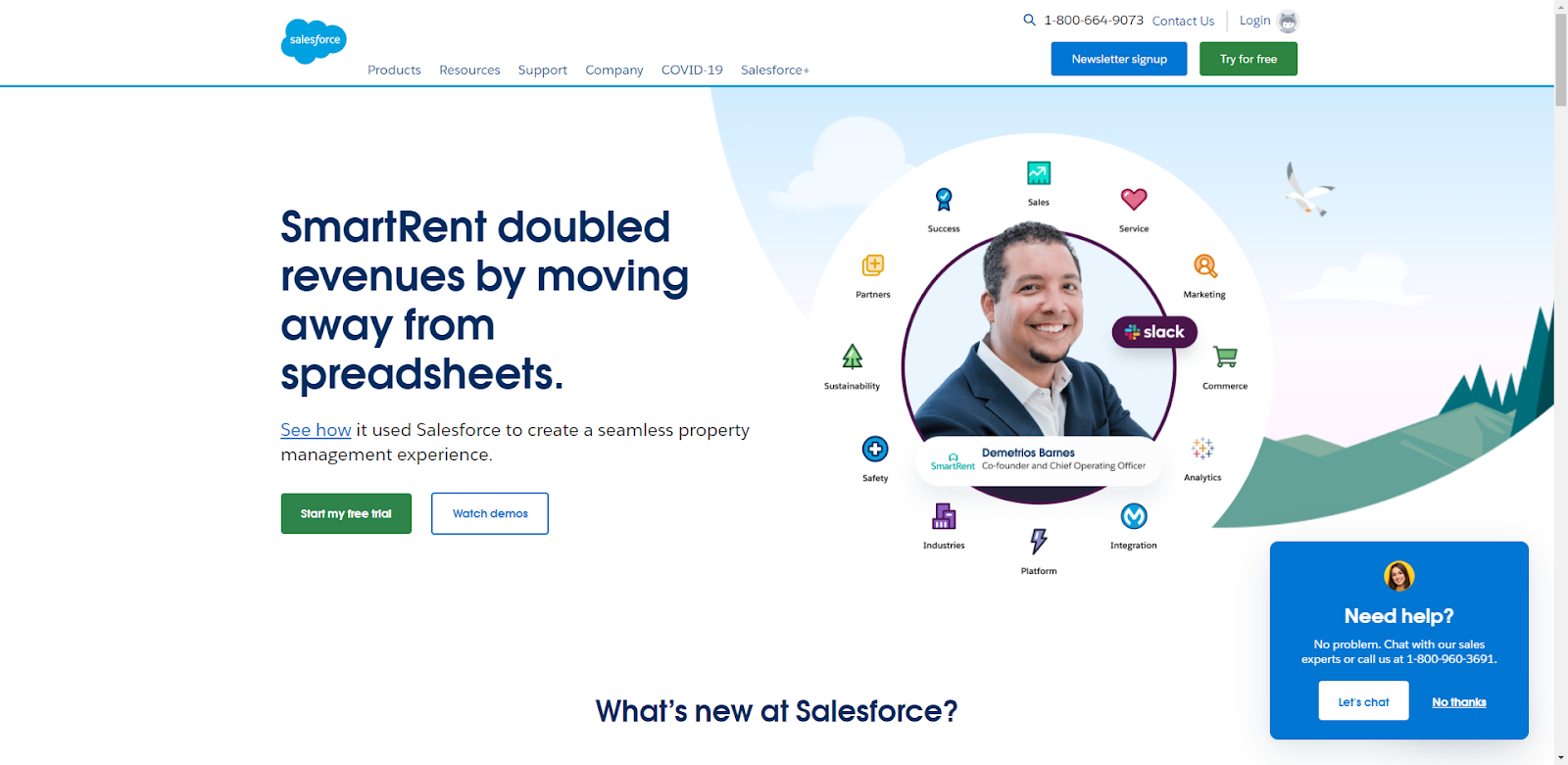
Salesforce instantly pulls us in with their clean, trustworthy design backed by their blue and white color schemes and friendly Codey the Bear mascot. As a brand somewhat synonymous with the software cloud, you’d expect their site to live up to certain standards of exceptionalism.
Salesforce does a great job of blending animated elements with custom iconography as well as actual client pictures, and heavily relies on the resource section to provide a learning experience rather than solely pushing products and services. Their gratuitous use of whitespace coupled with strategically positioned CTAs make this website a win across all fronts.
Ranking & Traffic metrics:

Salesforce is a juggernaut in the SEO space with nearly 900,000 ranked keywords, a traffic estimate of 4.3M visits a month, and a traffic value of $15.7M a month.
Steal this awesome SaaS design feature!
- Consider a highly recognizable mascot for brand recall and to create an element that separates you from your competitors.
Paychex

According to Apps Run the World research firm, Paychex is the 10th largest payroll software provider in the world, paying one of every 12 American private-sector employees.
With this massive amount of clout you’d expect a very streamlined and corporate site. I like their no nonsense heading, singular CTA, and applicable hero image above the fold. Paychex does social proof the right way, with multiple sections dedicated to why customers use them, loads of testimonials, and a large recognition section.
I also like the use of the primary takeaways of their solutions as succinct bullet points and attractive CTAs (ex. Run payroll your way).
Finally, the solution finder sections – one by business size and the other as a short conditional logic questionnaire, are fine-tuned for sales funnel brilliance.

Ranking & Traffic metrics:
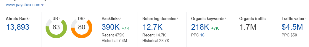
Paychex ranks for a respectable 218,000 keywords, drives an estimated 1.7M visits a month, and has organic traffic worth $4.5M.
Zendesk
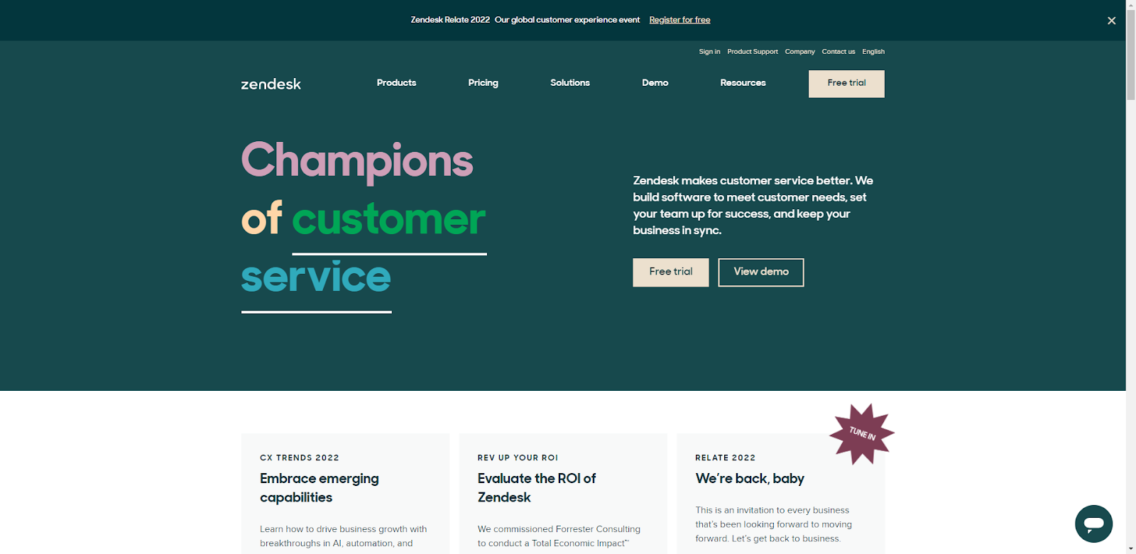
Zendesk certainly embodies the corporate website look albeit with some risk-taking in terms of their dark background hero and multi-colored heading. An interesting design feature that is unique and attractive is the columnization of the heading (H1) and description statement.
The rest of the site places an emphasis on resources immediately below the fold and then multiple case studies that serve to discuss how their products work in lieu of actual product sections.
The bottom half of the site earns your trust with social proof in the form of an encapsulated Gartner award and highly recognizale client logos before ending with some subtle links to some of their most popular articles.
Ranking & Traffic metrics:

Zendesk ranks for nearly 300,000 keywords, drives an estimated 604,000 visits per month, and has a traffic value of an impressive $3.8M.
GitHub
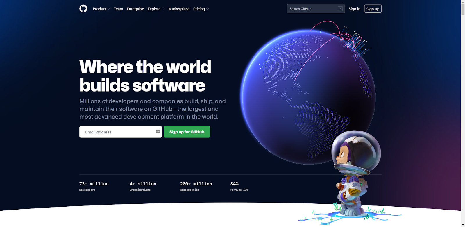
The GitHub website is a primetime example of a brand that knows exactly who their buyer persona is and exactly how to cater to them with aesthetics and content.
From their dark hero image with an animated globe and cartoon space cadet, to the perfectly contrasting CTA to sign up for GitHub, to their social proof of how far their reach goes, this site does it all. Do I even need to mention we are still talking above the fold!
What is unique about the GitHub website is their sub-section just below the fold with various benefit statements placed in a sub-menu that is easily-navigated with anchor links. This sub-section then becomes the sticky menu for the duration of downward scrolling, which is a unique design feature I have not seen anywhere else.

The contents of this section are laser-focused on their buyer persona and are beautifully animated with screenshots and accompanying text before landing our space cadets down on a badass cartoon footer that makes even non-developers want to get out there and code.
Ranking & Traffic metrics:

GitHub ranks for a massive 15.9M keywords, drives an estimated 32.5M visits a month, and has a traffic value of $18.1M.
Workday
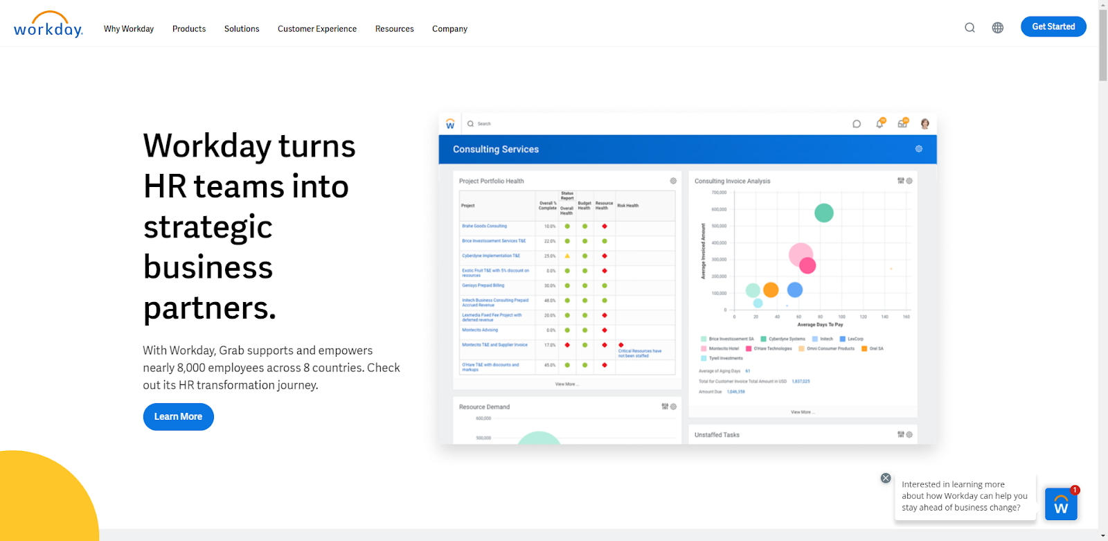
Workday’s enterprise management cloud website goes hard in the paint with bold graphics and screenshots, a minimalist design, and lots of white space.
Workday seems to want its visitors come away with the idea that their software will simplify their worklives with succinct benefit statements, a large emphasis on client success stories, and a minimal use of text.
Compared to most enterprise websites, Workday does not have a lot going on the homepage. I believe this shows they are resting on their brand recognition somewhat in terms of their design, or have sort of built their homepage in a way that encourages visitors to click through to learn more.
Ranking & Traffic metrics:

Workday ranks for 134,000 keywords, drives an estimated 1.8M in traffic, and has a traffic value of $2.5M.
Segment
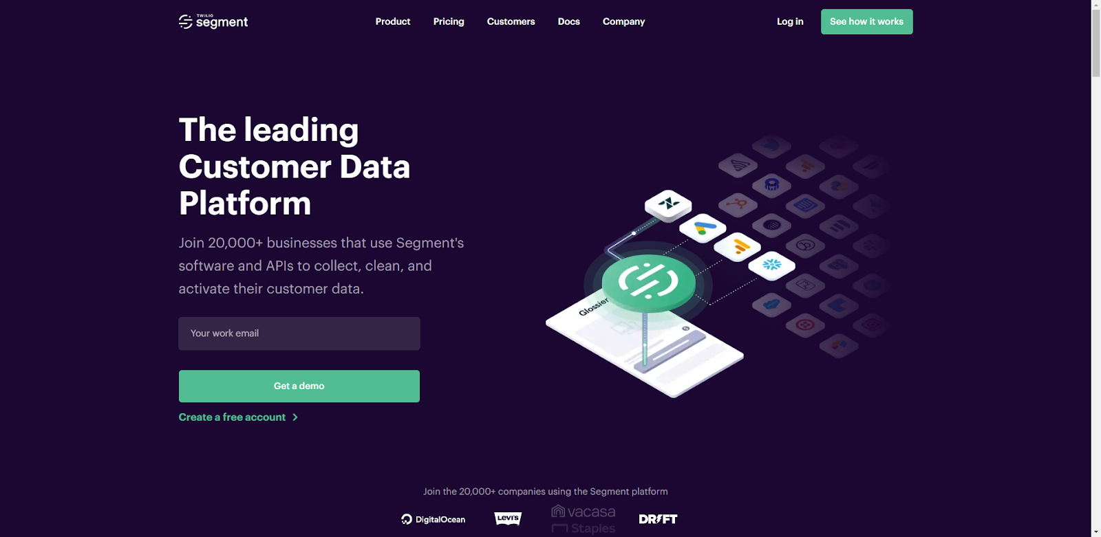
Segment, in my opinion, is one of the best SaaS websites on the internet right now. I really like how they seamlessly blend their brand colors into the whole site and make a dark aesthetic feel approachable when everyone else is banking on white backgrounds and the safe corporate look.
Where Segment shines, though, is with their custom graphic design elements that expertly tell a story of how their software works to connect customer data from all of your existing tools. They are a bit more subtle than most of the other enterprise SaaS sites we’ve featured in their use of social proof, but they do infuse a few instances of client logos and case studies into the site really well.
I like that Segment has also minimized their use of actual product screenshots as those can often take away from the aesthetics of a website. This is not to take away from the UX or UI of the actual software, this is just to say a beautiful site is not always complimented with software screenshots.
Ranking & Traffic metrics:
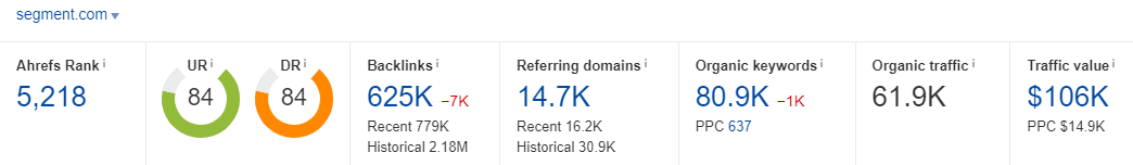
Segment ranks for 80,900 keywords, drives an estimated 61,900 visits a month, and has a traffic value of $106k.
Steal this awesome SaaS design feature!
- Create custom graphics using your brand colors that show how your software works.

Drift
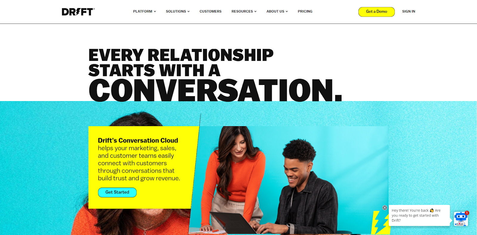
Drift is another example of a (mostly) corporate-facing brand that has gone bold with their design, color schemes, and fonts.
Having purportedly invented the sector around “conversational marketing,” Drift does a good job of focusing their website design on having conversations, showing how they help you help your customers, and how to use their software to crush your customer service goals.
The bold in-your-faceness of the site may not be for everyone, but it certainly drives some excitement which is exactly what the brand is wanting to do.
Ranking & Traffic metrics:
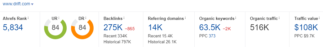
Drift ranks for 63,500 keywords, drives an estimated 516,000 visits a month, and has a traffic value of $108k.
Best SaaS Websites Serving the SMB Market
As discussed earlier, there seems to be something of a distinct SaaS website design difference between those SaaS companies that serve enterprise clients and those that serve SMBs. The SMBs seem to “talk” more to small business owners, marketers, or those who have different goals than onboarding a software to 1,000s of employees. Note the distinction in the look and feel of these SaaS websites as you look through them to see if you agree.
Shopify

Shopify as a brand seems to have beaten it’s ecomm competitors SquareSpace and Wix to a pulp as me in the SEO and web design world never seem to have clients using either of those platforms.
Their website is unique as it does feel more like an online store than a SaaS website, but it is very approachable, easy to navigate, and the homepage seems to address all buyer hesitations right away.
The only oddly designed aspect of the website is the massive animated globe showcasing where the platform is used, which seems to be oddly placed in respect to the rest of the website.
Ranking & Traffic metrics:
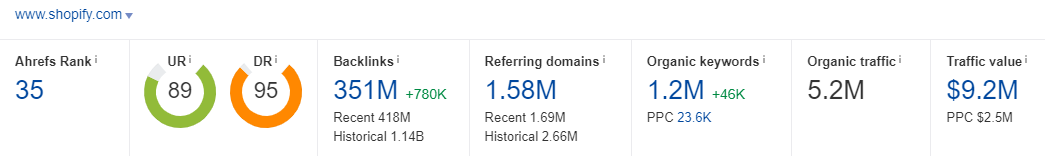
Shopify ranks for 1.2M keywords, drives an estimated 5.2M in organic traffic, and has a massive traffic value of $9.2M.
FreshBooks
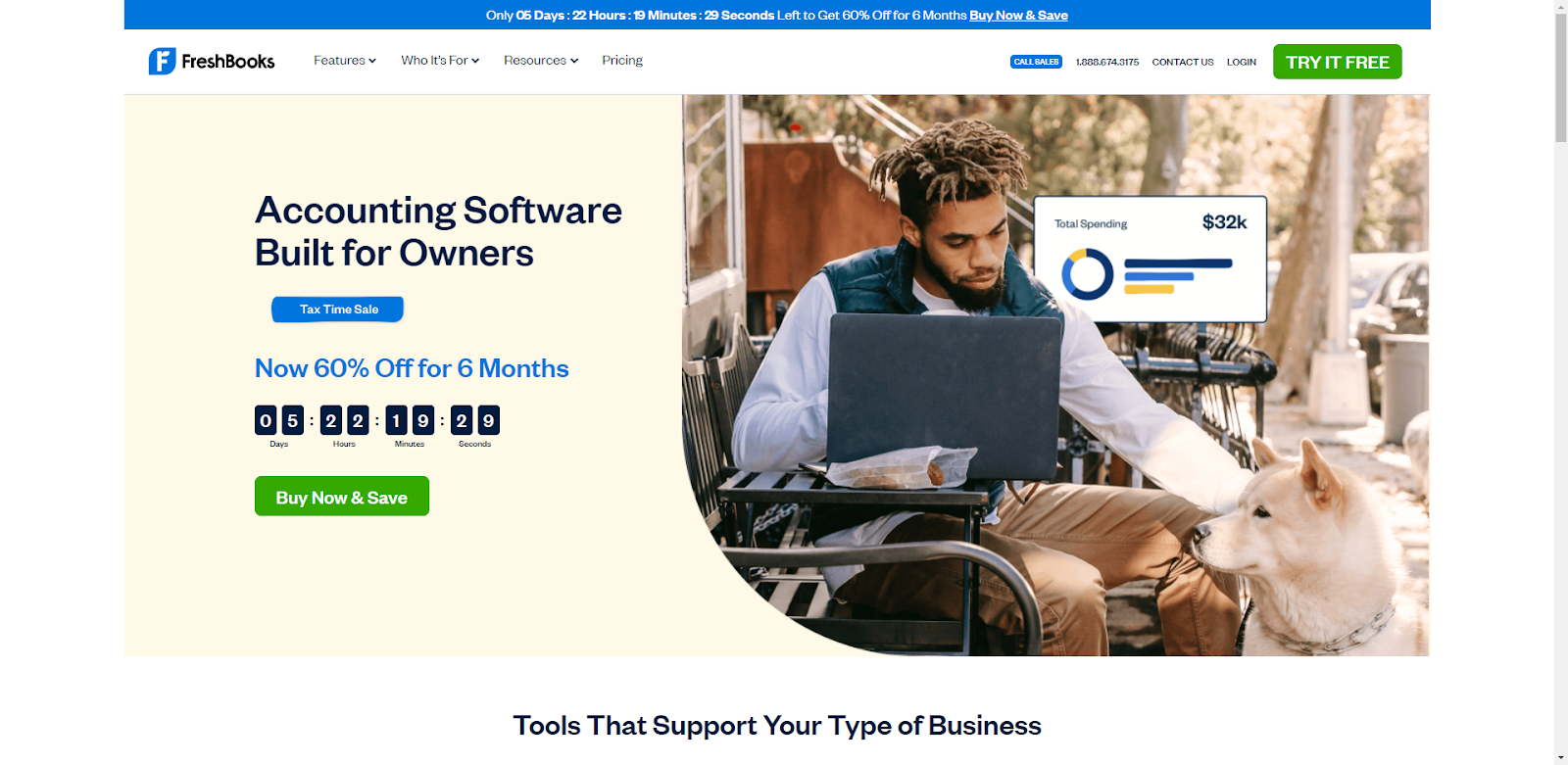
Accounting software sites are getting more competitive these days and we honestly could have gone with a number of options here. What makes the FreshBooks site stand out, however, is their specific addressing of the small business owner market.
From their headings, to their image usage, to their section on use cases, this site is designed with the small business owner in mind.
The white and blue color palette has a psychological trust factor built in, and the beige background color in the hero image has a calming effect that subconsciously puts you at ease (something you want when dealing with your money!).
I like the FreshBooks features section which does an excellent job of showcasing eight separate features without taking up a huge section on the website.
The remainder of the site gets gold stars for usage of social proof, highlighting of integrations, and additional selling features around why SMBs love the software.
Ranking & Traffic metrics:

Freshbooks ranks for 514,000 keywords, drives 1M visits a month, and has an estimated traffic value of $1.5M.
Steal this awesome SaaS design feature!
- When you have a lot of Features to showcase but don’t want to create massive sections on your page, consider a tab option like the below.
Mojo

Before telling you how great the Mojo website is, I have to mention that we built it! Mojo is an ecommerce landing page software that made it big with the direct response industry and carved out a nice niche catering to a very specific clientele.
The whole concept behind this web design was ease of use. From the language, to the light and thin fonts, to the actual screen recording of the software, and the integrations section, everything about the site is supposed to showcase how seamless this software is.
As a niche SaaS brand, we emphasized unique selling propositions such as its robust feature sets, its industry-specific effectiveness, and its use cases.
Ranking & Traffic metrics:
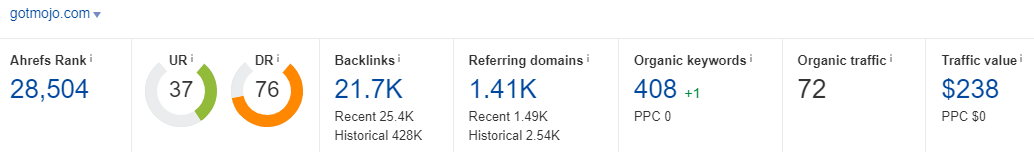
Mojo ranks for 408 keywords, drives an estimated 72 organic visits a month, and has a traffic value of $238.
Client Savvy

Client Savvy is another Digital Elevator website client that we recently finished up and will be bringing on to do SaaS SEO. Their service relies heavily on a software offering coupled with personalized consulting.
As such, the design needed to blend their client experience software alongside the knowledge that their tools are accompanied by humans. We used the hero area to emphasis the offering along with mentions of the software and advisory services within testimonials, and another layer or partner organizations – the client did not want to showcase their clients for fear of them being poached by competitors – to provide instant credibility.
The remainder of the site incorporates software screenshots along with custom graphic design elements to soften the aesthetic and showcase the product. A bold CTA towards the footer with a distinct background color rounds out this corporate small business SaaS site.
Ranking & Traffic metrics:
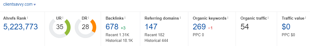
Client Savvy ranks for 269 keywords, drives an estimated 54 visits in organic traffic, and has zero traffic value.
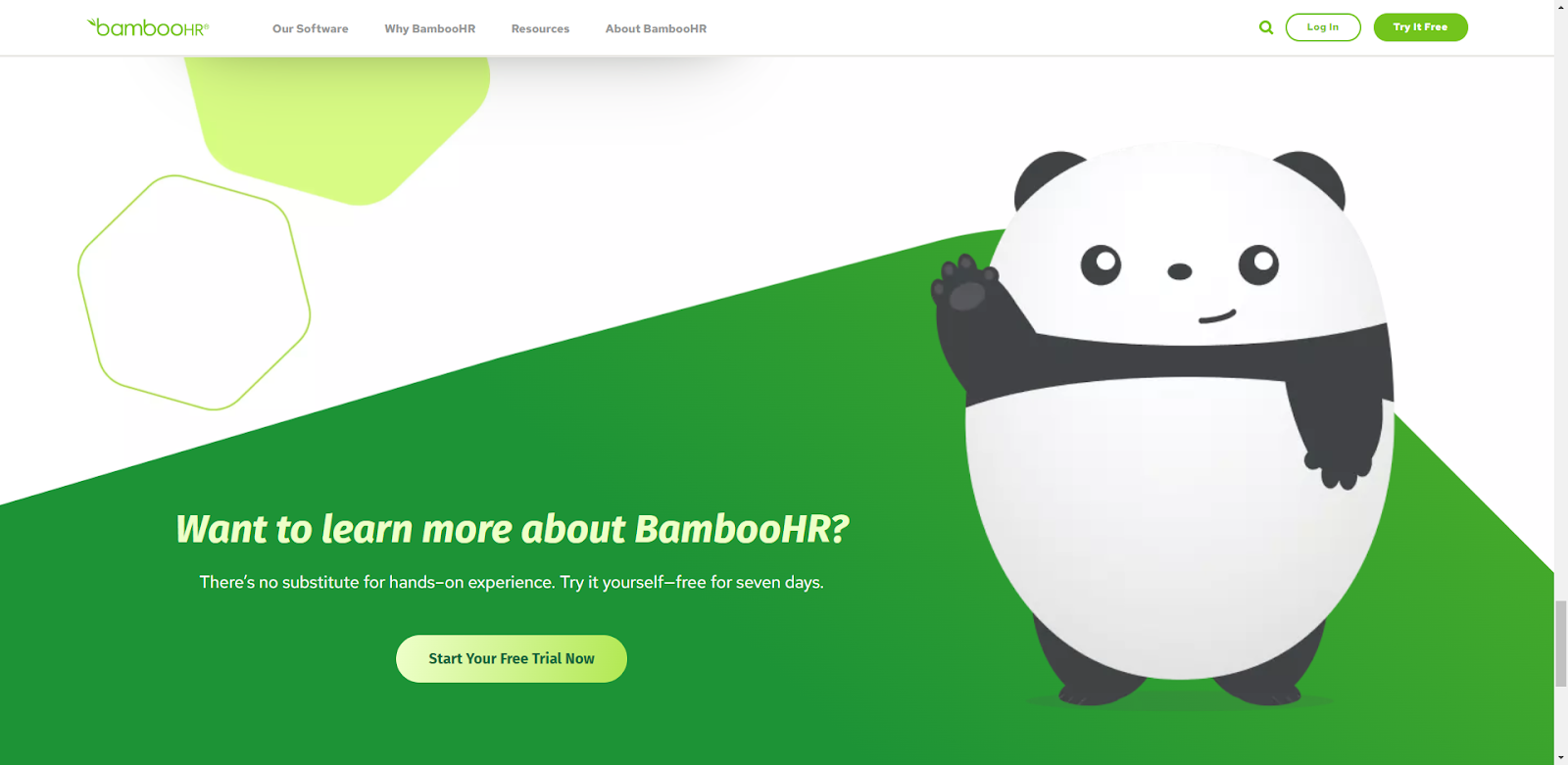
BambooHR

BambooHR gives you the feel-goods from the moment you hit the homepage with their organic color schemes and smiling faces. Their unique use of bamboo shoots graphics features actual business owners and their hero section also has an interesting use of a small resource slider that provides a friendly cohesiveness that is really approachable.
The background graphics pull you down the page. You’ll find no abrupt sectionality on this site, each section sort of blends nicely into the next with fun geometric shapes and soft corners.
Further down the page there is ample use of white space isolated the product’s benefits with testimonials and professional pictures of their actual clients.
The climax of the homepage is the mascot (remember Salesforce?) and a huge panda encapsulating a free trial CTA.
Ranking & Traffic metrics:

BambooHR ranks for 169,000 keywords, drives an estimated 636,000 visits per month, and has a traffic value of $1.1M per month.
Steal this awesome SaaS design feature!
- Go bold with your footer and have a large, cohesive CTA section where you go after demos, trialists, or sales.
HubSpot

HubSpot could have easily been featured in the SaaS websites that serve enterprise customers example but they arguably service more SMBs than enterprise clients on a sheer volume basis.
This site gets updated a lot, but at the current time of this writing they have gone with a corporate feel and a hero section that focuses on one CTA, their CRM. HubSpot, like so many other SaaS companies on this list, offers a number of different products so the takeaway here is that sometimes it is better to draw attention to one of your offerings rather than try to cover all of them in one message. When the time is right, it is likely they will update the hero and homepage to cover another one of their products.
HubSpot is a content marketing powerhouse, so it makes sense their homepage may be succinct compared to other SaaS websites on this list.
After the hero, they showcase their solutions, focus on a USP – their community, and end with some social proof and a final CTA.
Ranking & Traffic metrics:

HubSpot is a leader in marketing content, and their rankings for 377,000 keywords backs that up. They drive an estimated 1.3M visits a month and have a traffic value of $7M a month.
Harvest
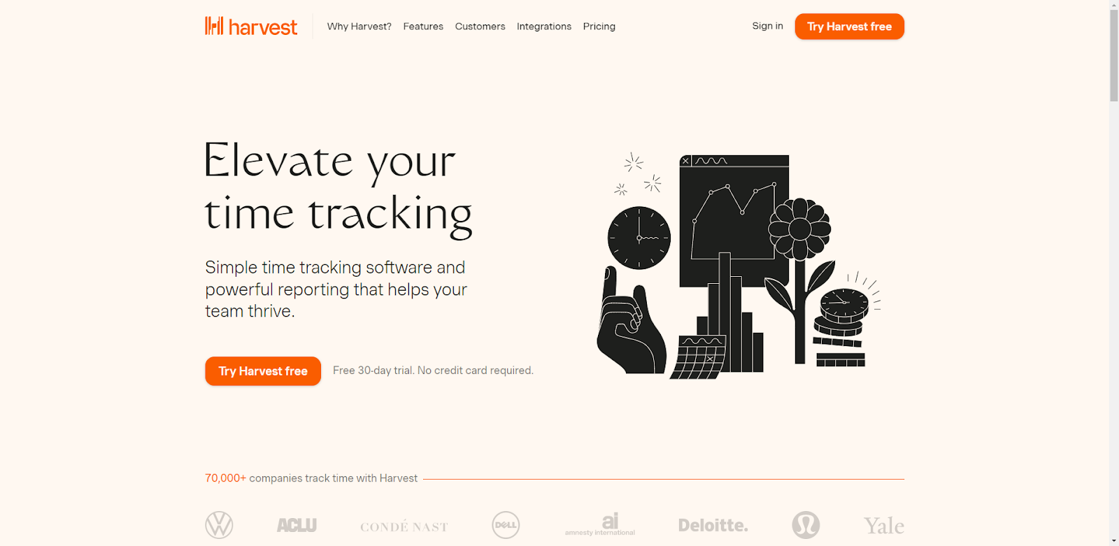
Time tracking software leader Harvest has some unique design features that have gone towards the calming and relaxed aesthetic. With their soft, almost peach background color and muted gradients, the brand gives a soothing feel to the otherwise chaotic task of time-tracking.
Their use of thin sans-serif fonts reinforces this look, and their custom graphics and iconography blend expertly into the rest of the site.
With a powerful use of social proof in client logos just below the fold and a singular use of a product screenshot, the brand keeps the design elements simple, minimalist, and straightforward.
Above the footer, Harvest does the opposite of what most SaaS websites do in that they end the page with a light, rather than dark, CTA element that stands out against the other colors.
Ranking & Traffic metrics:
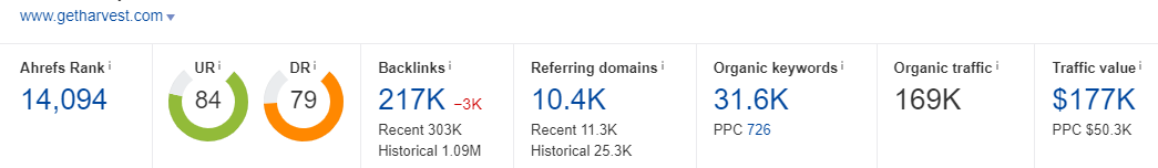
Harvest ranks for 31,600 keywords, drives 169,000 visits a month, and has a traffic value of $177k.
Mux
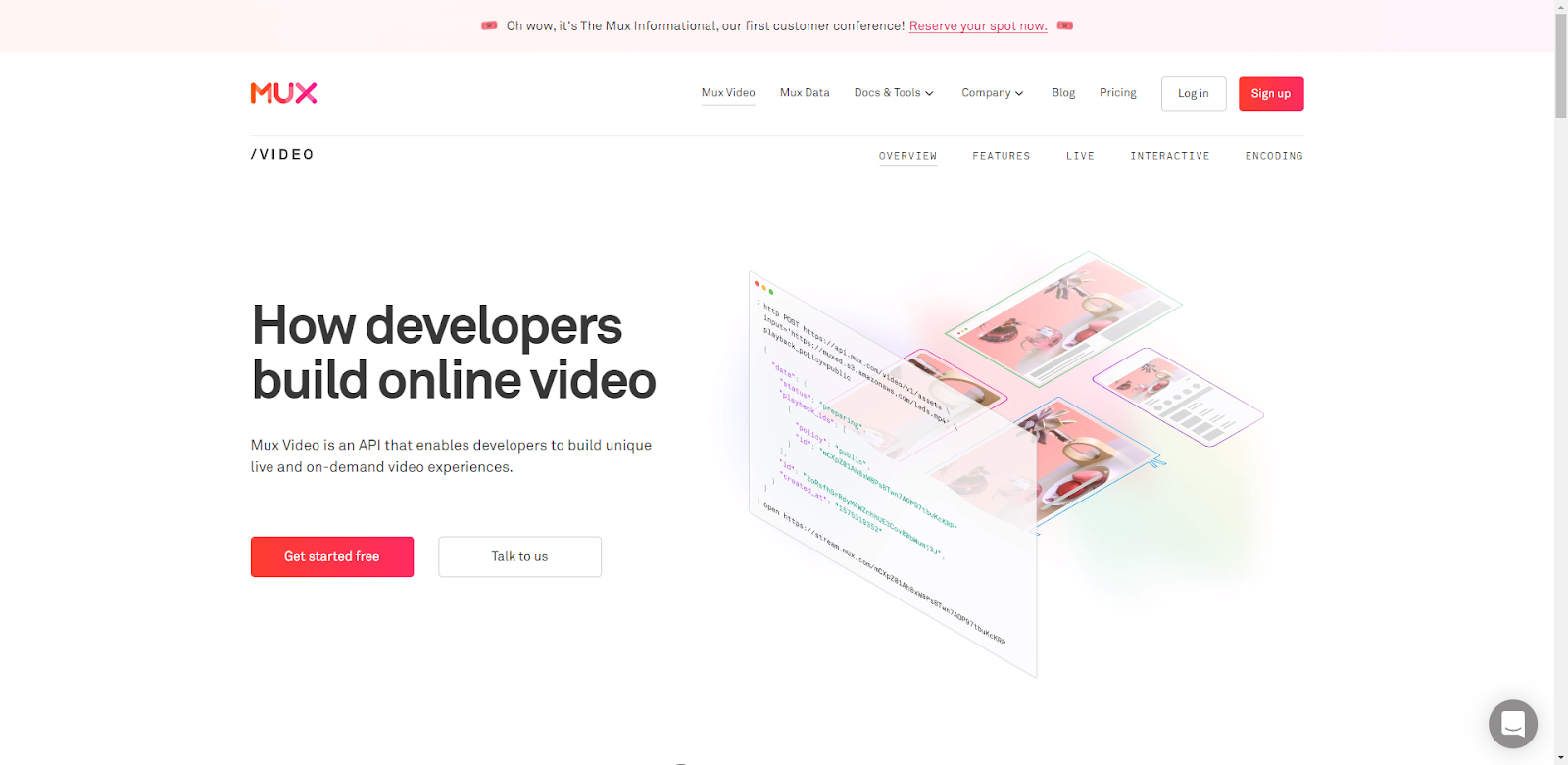
Of all the streaming industry sites that have popped up as of late, the Mux website probably has done the best job of putting together a well-strategized website.
They don’t mash their primary solutions into one hero area, rather, they focus on their Video solution on the homepage and treat it as their product page which is an interesting and respectable approach.
They have a high energy red-orange secondary color pulled from their logo that they use to great effect with their CTA buttons and some fonts. It contrasts seamlessly with the clean white background and bold, simple fonts.
Their hero animation tells the story of code to video, and the subtle social proof of client logos flows nicely into another wonderfully colorful section on benefit statements.
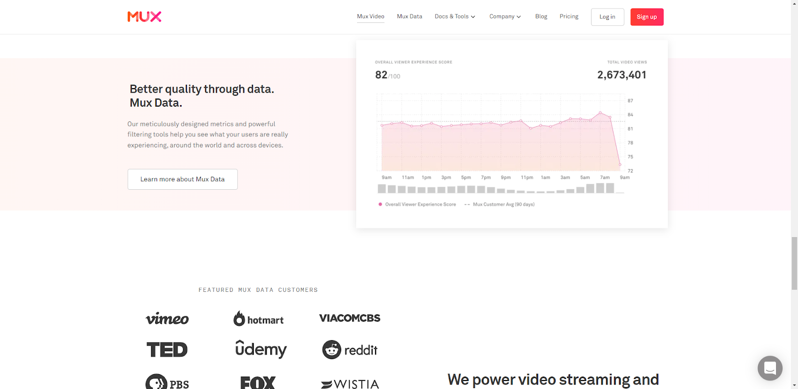
Like the GitHub website, Mux does an excellent job of speaking directly to its buyer persona with coding examples mixed with benefit statements that really showcase what the platform can do.
A smart data section with a light background breaks up the site before it all culminates with some credible social proof and the traditional dark pre-footer CTA.
Ranking & Traffic metrics:

Although they have an impressive 73 Domain Rating, Mux does not have much to brag about in terms of keywords, organic traffic, or traffic value (196, 16, and $1, respectively). Having firsthand experience in the streaming industry, I feel this more likely due to the infancy of the industry as a whole and keyword data still catching up to what potential users are looking for.
Steal this awesome SaaS design feature!
- Break up the background colors of your site with full-width sections that encapsulate important information like Mux does here.
Sendinblue
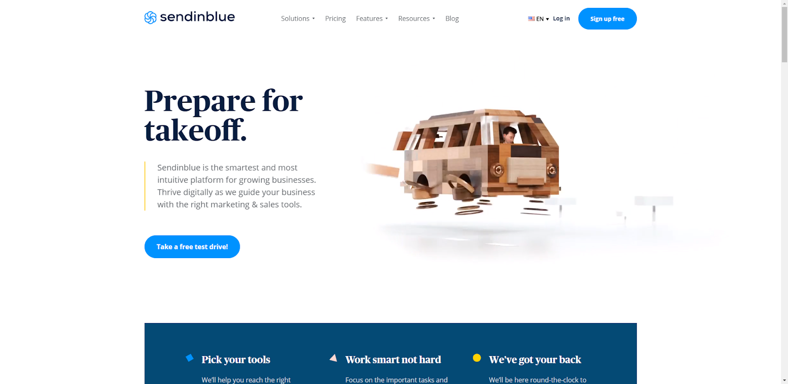
Fun seems to be the trend with most email SaaS providers these days. Sendinblue brings the fun home with their custom animation of a business owner – presumably you – scaling from bike, to car, to van, to flying fan in what is supposed to be the echo chamber of what it can do for your business.
With a trustworthy blue and white color palette, Sendinblue plays off the colors in it’s logo effectively while providing some additional pops of color as you navigate down the page.
I really like the third-party social proof in the form of the rankings on other websites (and the accompanying graphic).
The benefit statement section is a cleanly designed example of how to showcase a lot of Solutions without overwhelming the viewer with loads of information.
In the social proof section down the page, the transitioning use of client logos builds a lot of trust and credibility before ending the site with bolder colors and a final CTA.
Ranking & Traffic metrics:
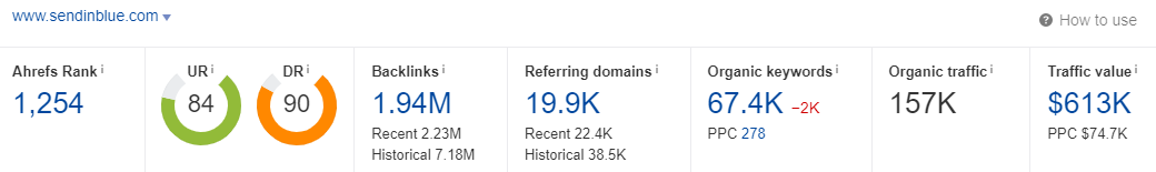
Sendinblue ranks for a very respectable 67,400 keywords, drives an estimated 157,000 visits, and has a traffic value of $613,000.
Steal this awesome SaaS design feature!
- If you have some awesome third-party recognition, don’t be afraid to show it off with a dedicated section on your homepage.

Helium

The introduction of crypto websites has introduced a new look and feel to the SaaS realm. From what I’m seeing, crypto sites like Helium tend to utilize dark backgrounds and bolder aesthetics than other SaaS sites.
This site specifically uses a black background with a secondary logo color and two other complimentary colors throughout. The hero area has some subtle animation but it’s really the remainder of the site that I like.
Cryptocurrency websites, by nature, have a responsibility to build trust and Helium does this by immediately showcasing its latest news and outlet logos to establish credibility in the coin.

The angular breaks in sections and color schemes lead the visitor section-to-section and the graphics in the device mining section give me sort of an Apple design feel.
Overall, the site does a really good job of maintaining the common styles expected for a crypto site while brining into play modern web design elements – bold text and colors – alongside generous portions of social proof.
Ranking & Traffic metrics:
For a crypto site, Helium drives an impressive amount of SEO stats. They rank for 16,700 keywords, drive an estimated 305,000 visits per month, and have a traffic value of $47k.
Best SaaS Websites Takeaways
These are some of our (me and the Digital Elevator team) personal favorite SaaS web designs right now. Many of them follow current design trends and have a similar look and feel, while others venture out and bring a bolder approach to aesthetics and color schemes.
It seems the favorite designs on our team are the ones that really know who their buyer persona is and how to echo their wants and needs in a site.
For example: Salesforce wants you to feel confident in them as a corporate powerhouse, so they use whites and blue and some fun mascots; GitHub goes heavy with a design heavy aesthetic to cater to developers; Harvest uses a calming color scheme to bring order to the chaotic world of time tracking.
When designing your next SaaS website ask yourself ‘What do my prospects expect to feel when they land on our site?’ The answer to that question is likely the direction you want your design team to take.
If you want help designing your next SaaS website, reach out to the awesome team at Digital Elevator to discuss your goals today.


